Bringing ideas to life with designs that speak, solve, and succeed.
Co-founder of Keen UX Studio, delivering innovative solutions for diverse clients. Previously enhanced the purchase and post-purchase journeys at ZALORA and spent 7+ years crafting enterprise products at ADP and HEXAGON AB, focusing on user-centered solutions that drive efficiency and user satisfaction.
💼 Work
ZALORA: E-Commerce Platform (B2C)
iOS, Android, Web, Design System
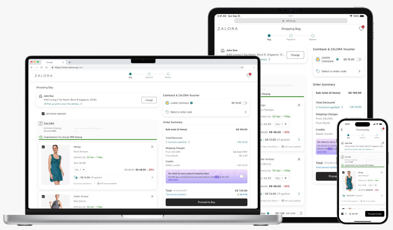
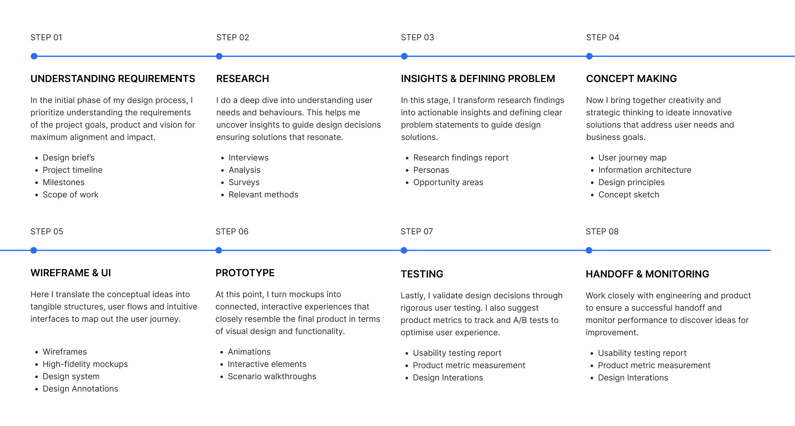
Enhancing ZALORA’s Cart Experience
2022 | Web, Mobile | +6.45% checkout completion rate
ZALORA Post Shopping
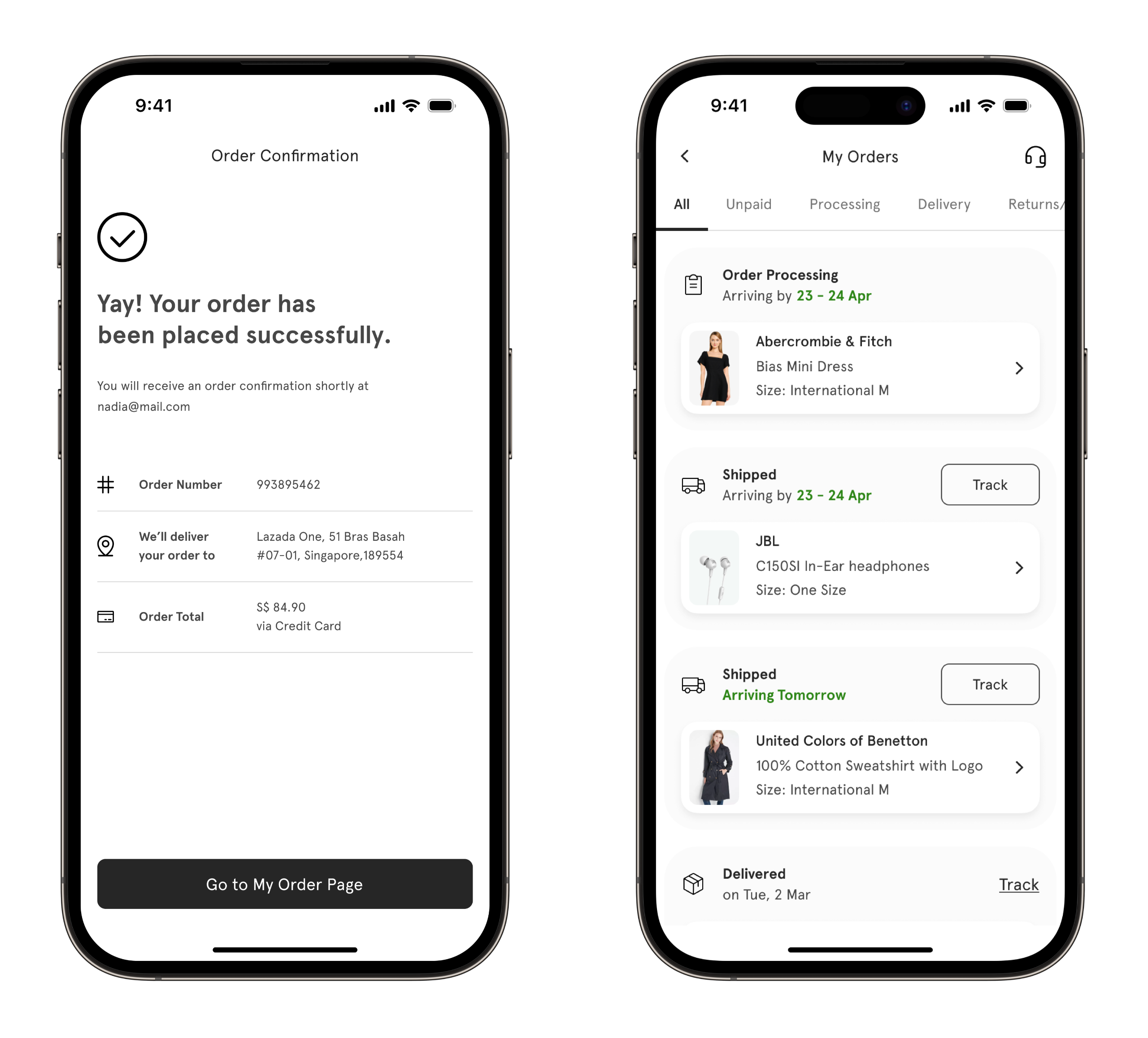
Made Smarter
2022 | Mobile | 6% decrease in contact rates
ADP: Human Capital Management Platform (B2B)
Web, Design System
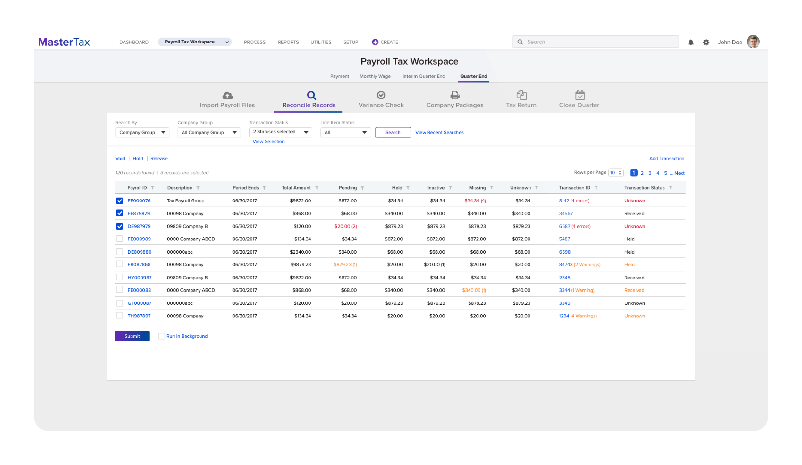
ADP Master Tax - Revamp
2018 | Web | Improved accessibility and usability
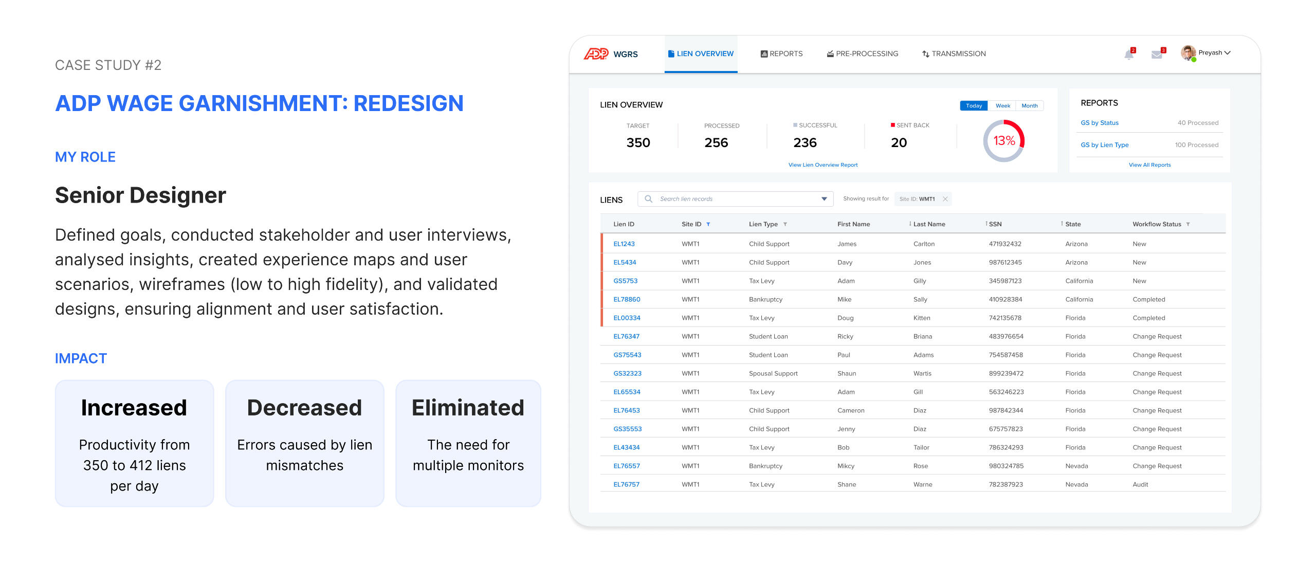
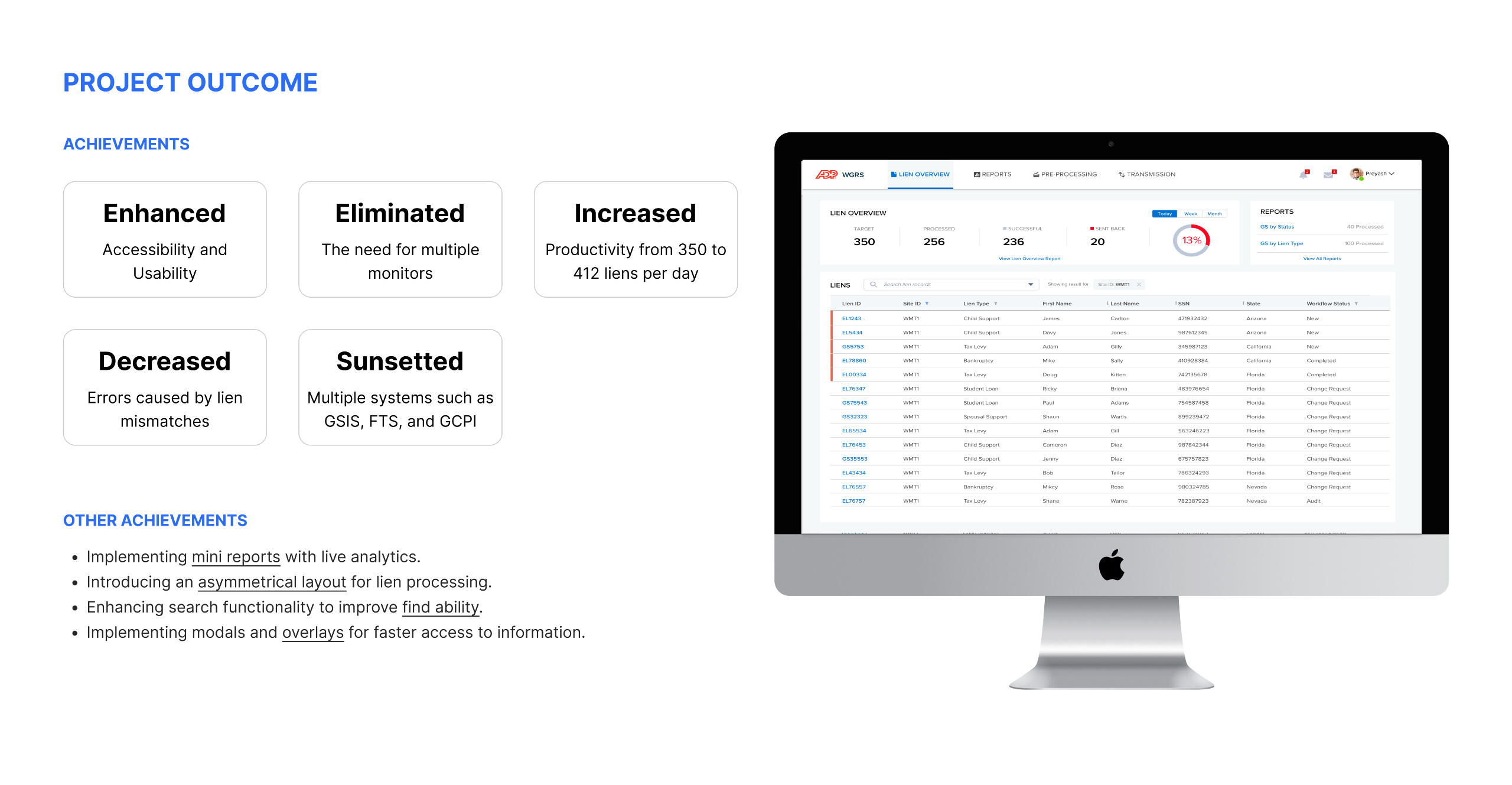
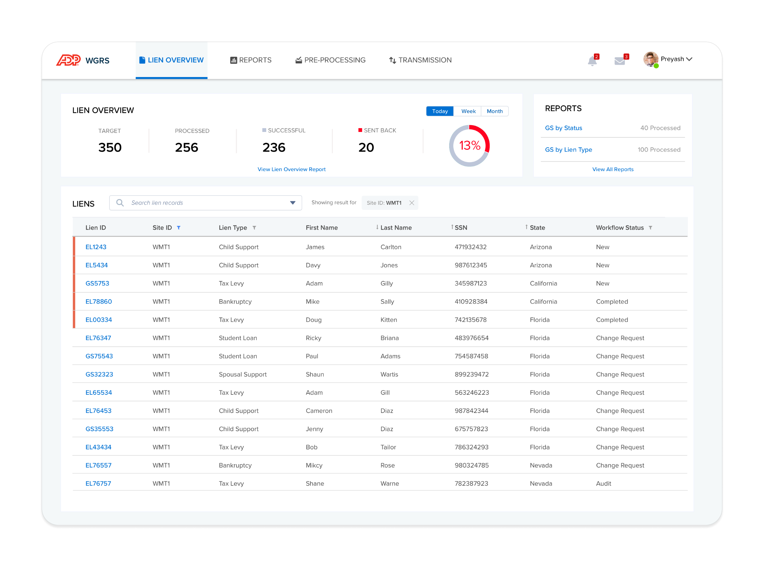
ADP Wage Garnishment:
A Ground-Up Redesign
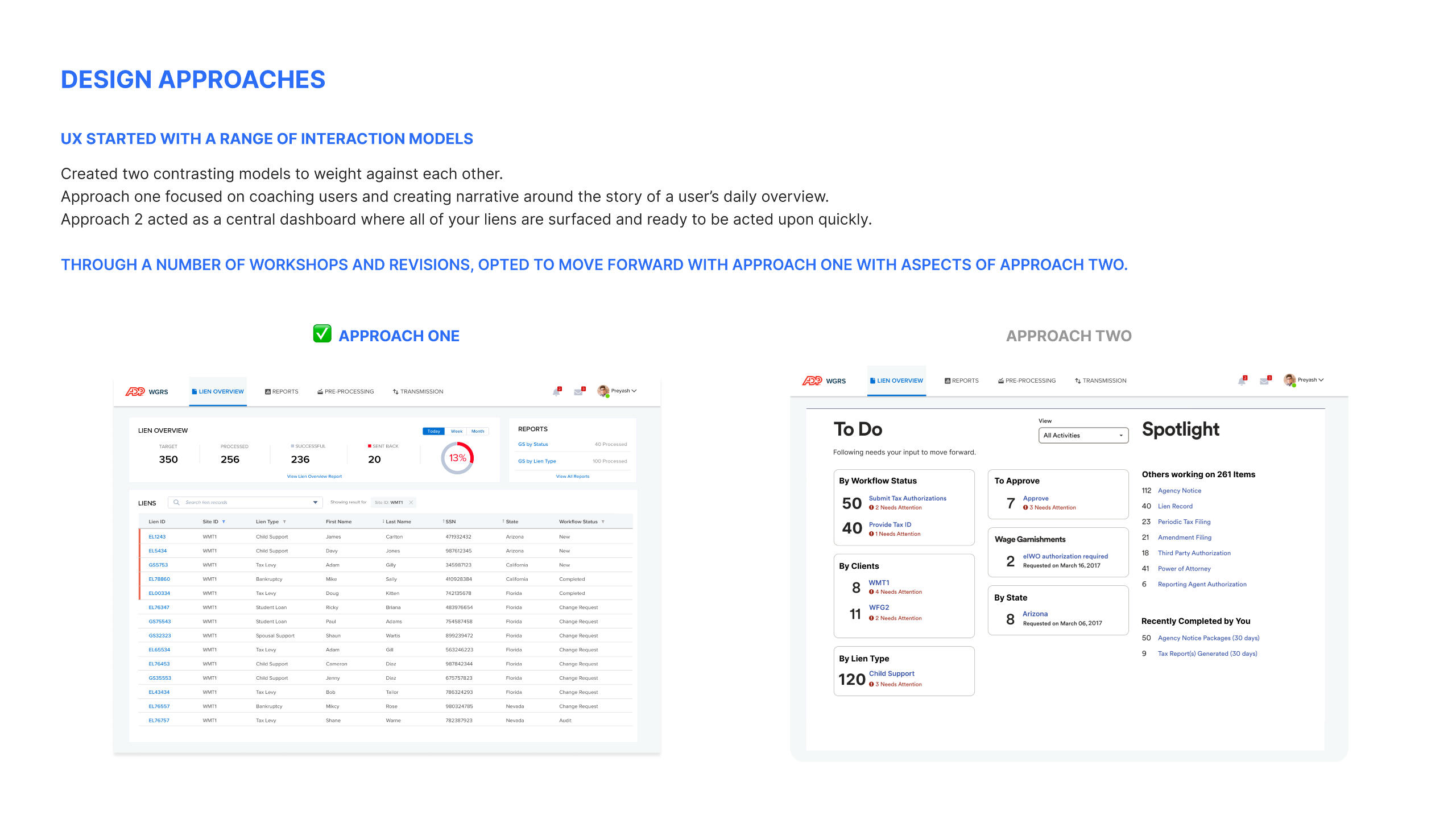
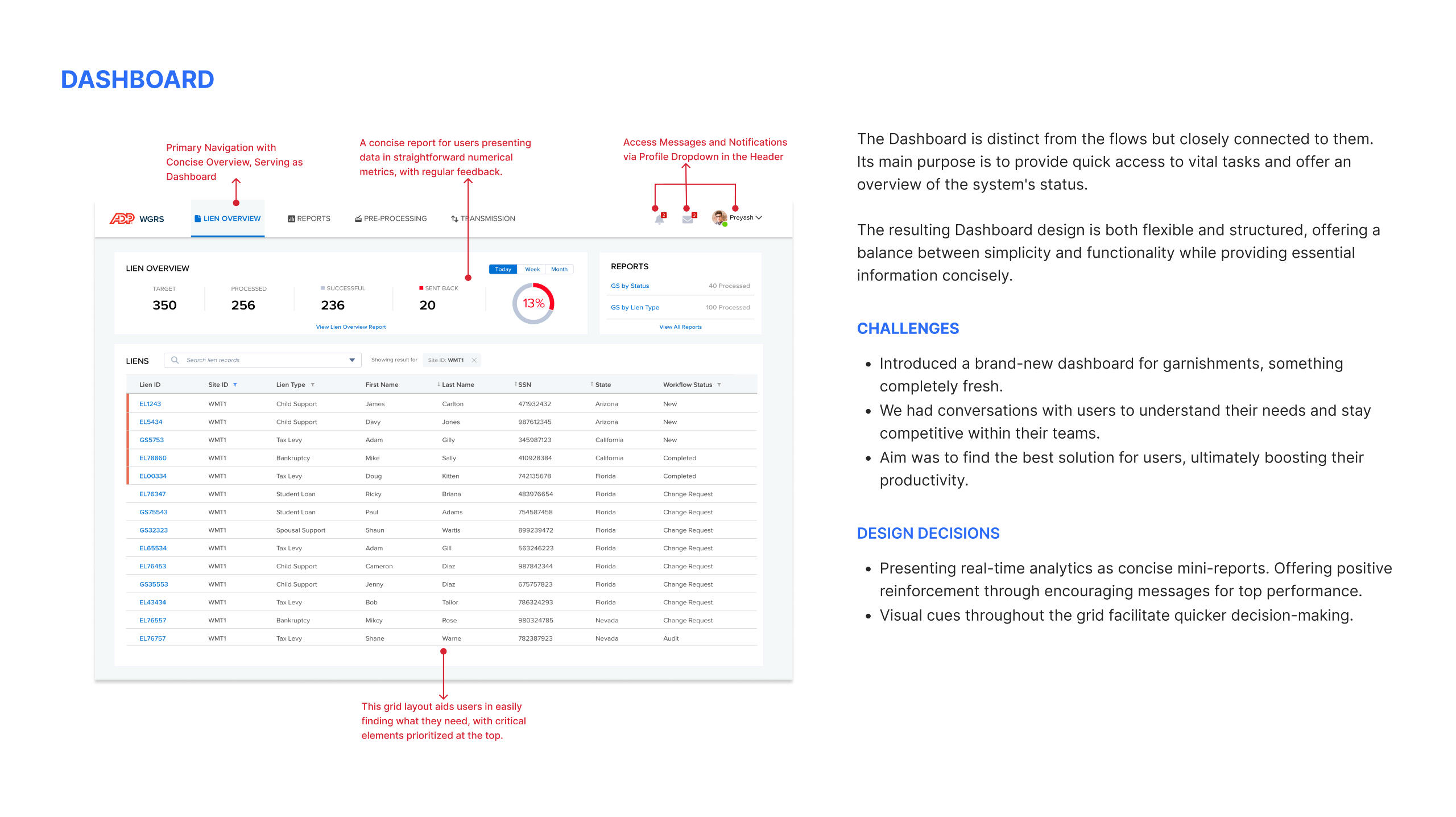
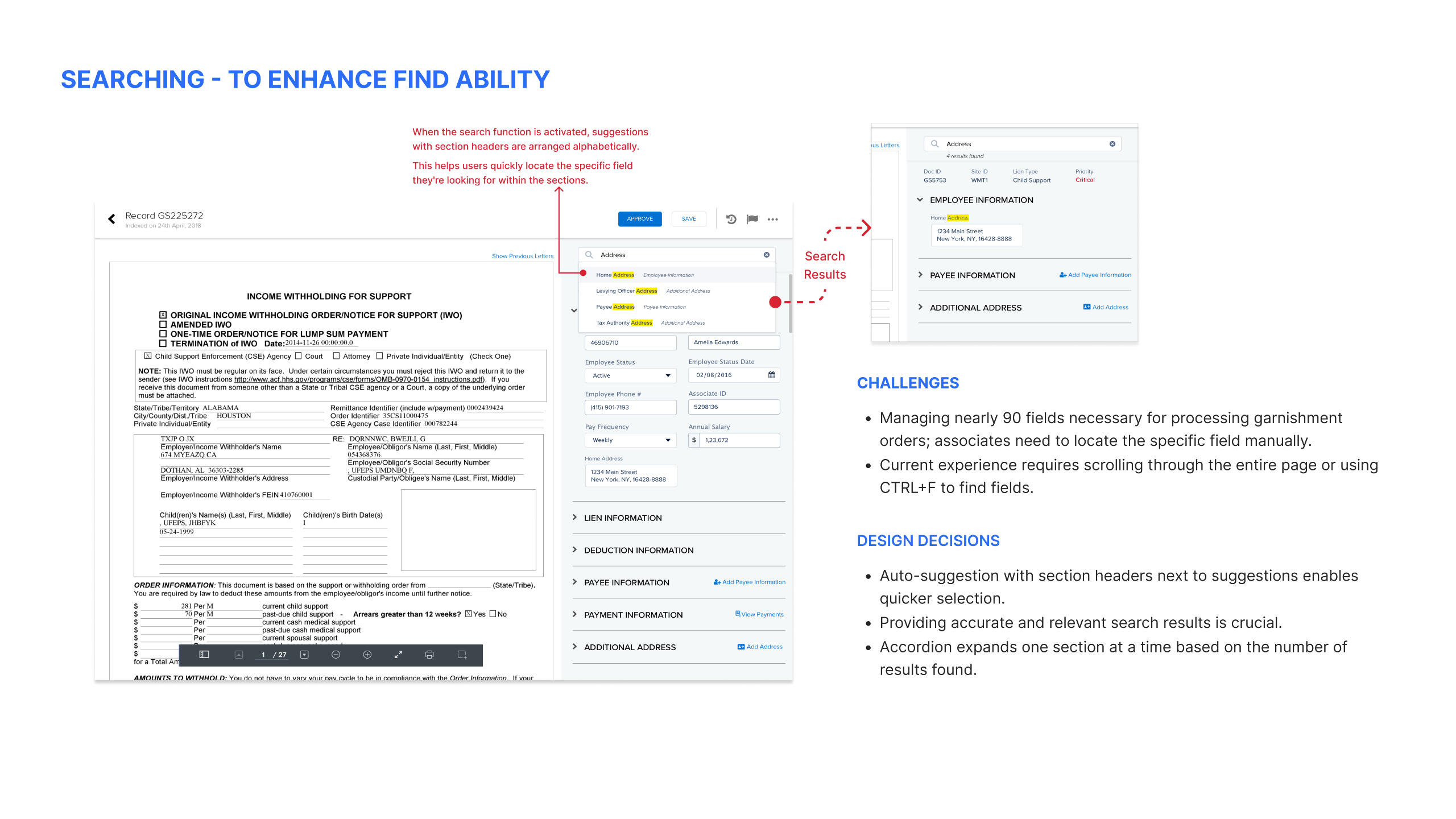
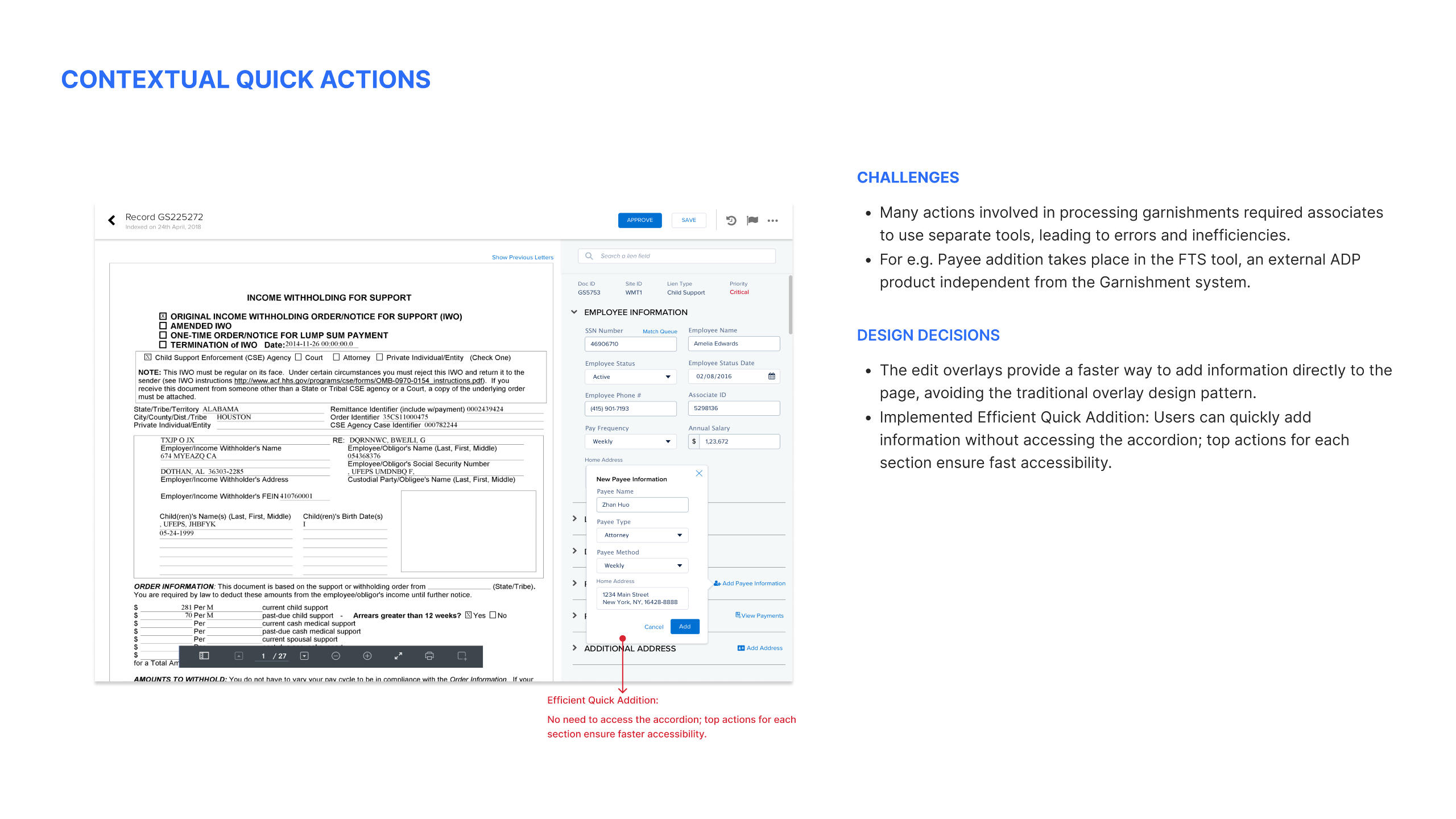
2017 | Web | 20% processing enhancement

Greetings! 👋 I'm Pankaj
A Product and Interaction Designer with over 10 years of experience. I’ve had the opportunity to work with leading brands like ZALORA, ADP, and Hexagon AB, where I focused on scaling products into meaningful and delightful user experiences that align with both consumer needs and business goals.My journey has taken me through various environments, from agile teams to more traditional setups. I’ve contributed as part of large design teams and thrived in solo roles, always championing user-centered design with a "Form follows Function" approach.Now, as Co-founder of elev-8, my own design studio, I continue to push boundaries and create innovative solutions for diverse clients.Outside of work, I enjoy spending time with my daughters, extensive reading, and capturing thoughts in my trusty diary, whether in meetings or during quiet moments.
Get to Know Me Better!
Constant Learner 📚
Learning has been one of my driving forces throughout my career. I constantly try to reinvent myself in different roles.
Multi-Platform Explorer 🧳
My portfolio shows my interest in designing for Mobile, Web, Tablet, B2B, and B2C. I've previously focused on helping B2B companies enhance business metrics with design.
Always Curious 💡
Understanding the broader context, with strategic planning and business aspects of design has been very beneficial in my career.
Critical Designer 🤔
I'm a problem solver and a passionate crafter. One can expect me to be extremely critical when it comes to making a design decision.
Enjoy Teaching 👨🏼
I enjoy teaching and discussing various topics with different people. It's a great-way to develop by helping others grow.
Adamant Stakeholder 💪
Getting a design chair at the table is crucial, and I can be very adamant about making things right when it comes to a design team.
Experience

Process
How we transformed ZALORA’s frustrating cart experience into delight while driving a 6% increase in checkout completion rates and an additional $40K in monthly revenue.

Problem Statement
The ZALORA checkout experience faced significant hurdles, with high cart abandonment rates and a drop in completion rates.
The challenge was to streamline the checkout process, addressing user frustrations while enhancing trust, usability, and efficiency.
My Role
Design Leadership: Spearheaded the project from ideation to execution.
User-Centered Approach: Advocated for user needs at every step.
Responsive and Consistent Design: Ensured uniformity across devices.
Collaboration: Worked closely with cross-functional teams.
Impact
+6.45% checkout completion rate
-15% cart abandonment
$40K monthly uplift in NMV
Improved user satisfaction and platform consistency
Why Zalora needed to revamp its checkout experience?

Approach
We implemented a well-defined, structured process to address these challenges, placing user needs at the forefront while ensuring each step was grounded in iterative design and data-driven decision-making.
By combining thorough research, prototyping, and continuous testing, I was able to create solutions that balanced user satisfaction with business goals.
This approach not only showcased my ability to tackle complex problems systematically but also highlighted my commitment to delivering impactful and user-centered designs—qualities essential for a design leader who drives results with a robust and scalable process.
🔍 Step 1: Understanding the User
-> In-depth Interviews
We conducted 1:1 in-depth user interviews with 18 participants to identify problems with the existing flow.
We ran a deep dive on Cart, and Checkout experience to get to know pain points and improvement areas.
I partnered with the researcher to carry out the 1:1 interviews.
Along with UX the researcher prepared the interview script and validated it by the PM and Design head.
Text
-> Critique workshop with stakeholders
In parallel with conducting in-depth user interviews, I facilitated a comprehensive critique workshop involving key stakeholders: the Head of Design, Head of Product and Engineering, Customer Support Leaders, and fellow designers.
Goal:
The primary objective of this workshop was to collaboratively identify pain points in the cart and checkout process and align on potential solutions.
By bringing together diverse perspectives, the session aimed to ensure that design decisions addressed both user needs and business objectives while being technically feasible.
Approach:
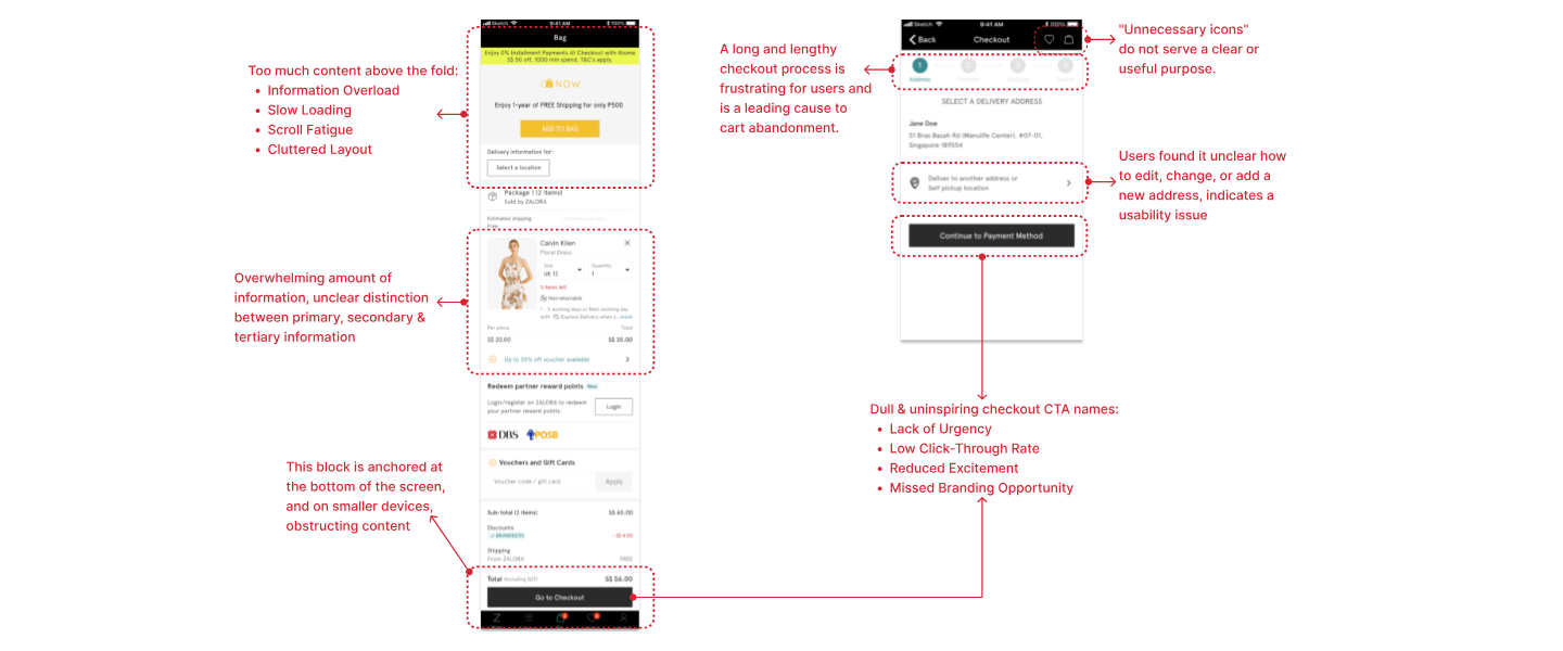
During the workshop, I presented insights from initial user research, highlighting usability issues and behavioral patterns.
This included problems such as overwhelming information hierarchy, unclear address editing functionality, and uninspiring checkout CTAs (as showcased in the attached analysis).
Stakeholders were encouraged to share their expertise, brainstorm ideas, and critique proposed solutions.
Output:
The workshop resulted in actionable insights and a prioritized roadmap of improvements:
Simplification of content above the fold to reduce clutter and improve load times.
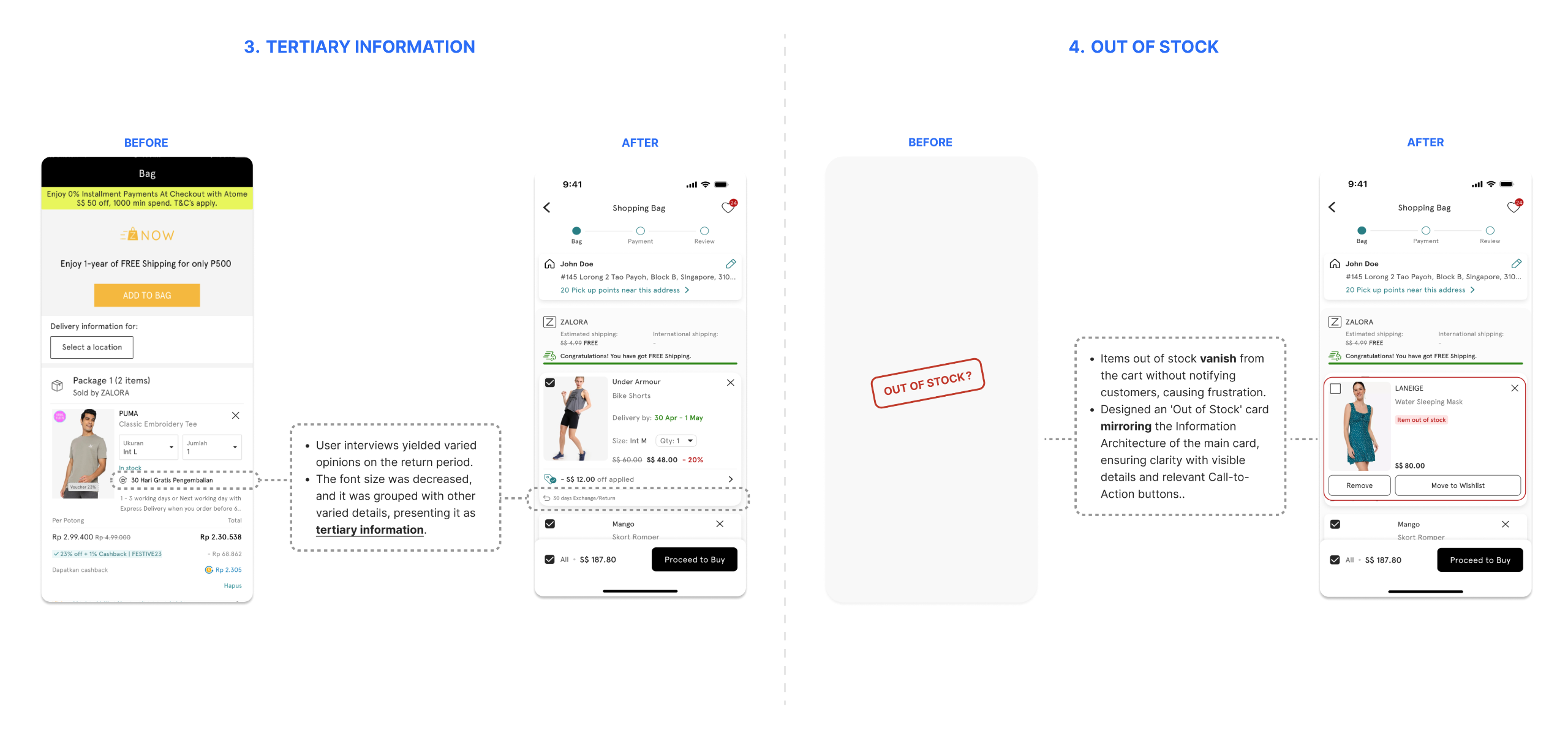
Clearer separation between primary, secondary, and tertiary information to enhance readability.
Improved address editing functionality to reduce confusion and support tickets.
Revamped checkout CTA design to incorporate urgency, brand consistency, and better click-through rates.
💡 Step 2: Defining Solutions
-> Main customer problems after synthesizing data

-> Solution for Problem #1
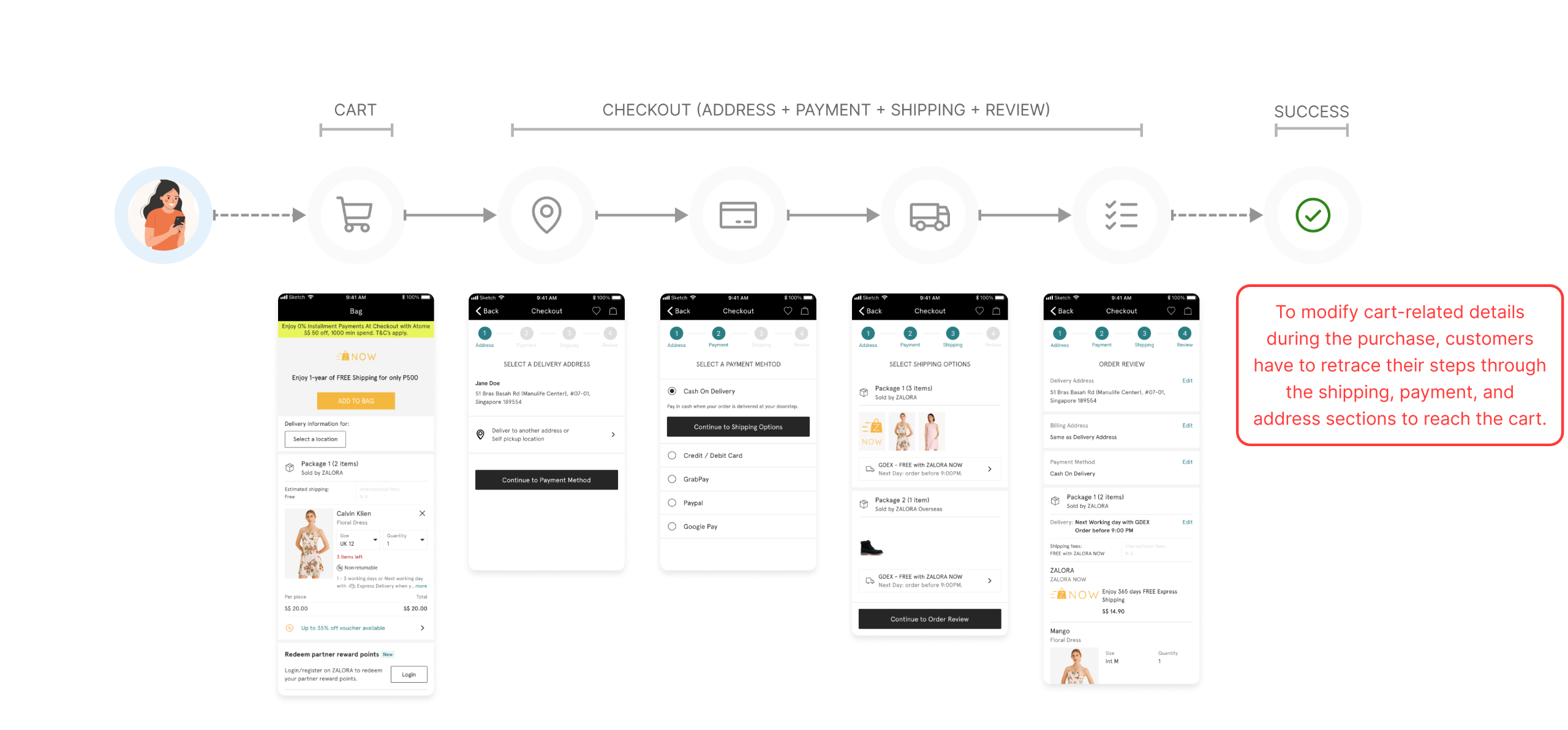
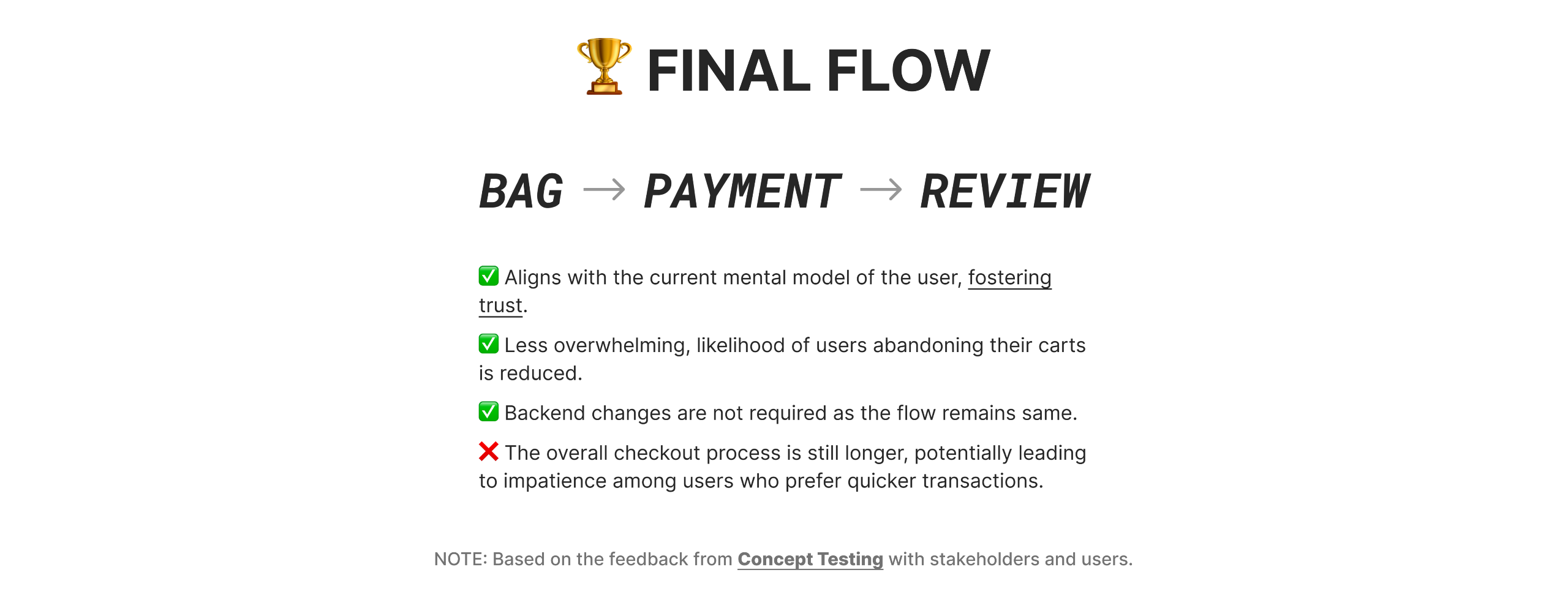
Create a seamless flow for modifications without backtracking.
Zalora checkout flow (OLD)
Approach
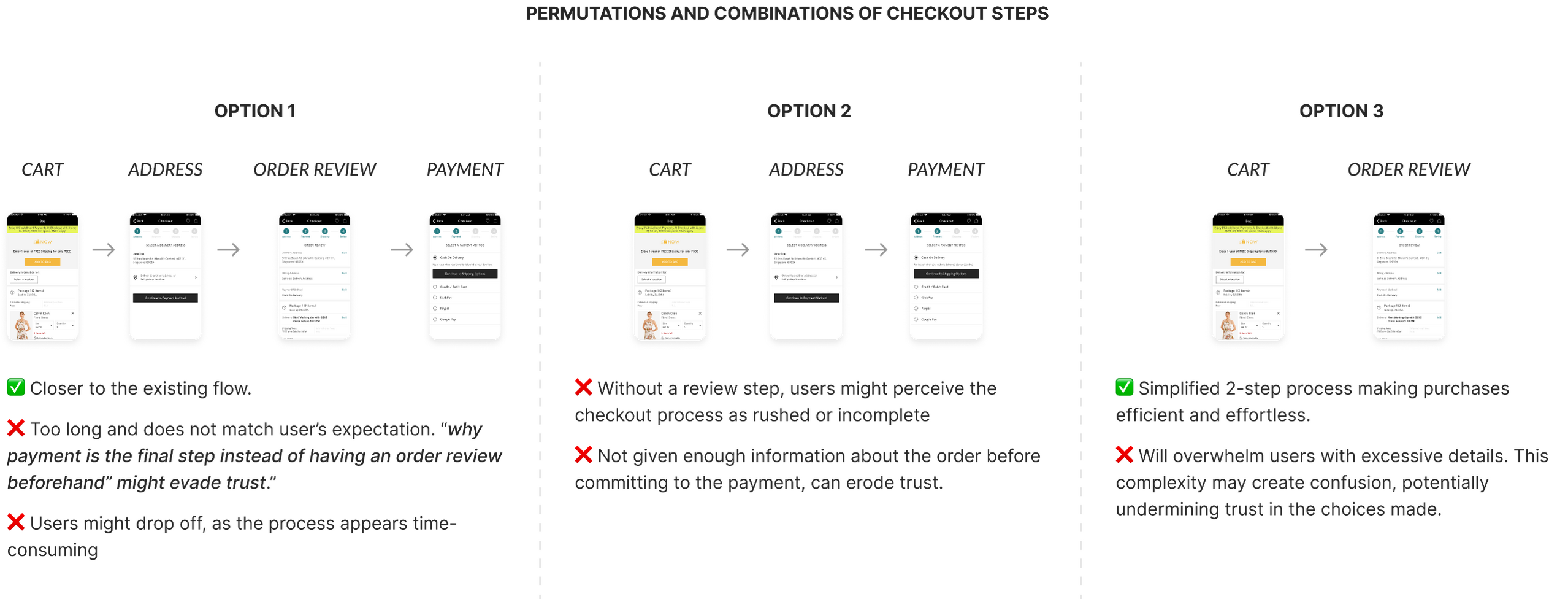
Before diving into the design phase, I focused on defining the sequential steps the user needed to take and compiled a set of questions to address with each reference I explored:
What is the sequence of steps for a successful purchase in the app that keep the TRUST?
Is the flow optimised for speed, simplicity, maximum context setting, or a combination?
Strategies to minimise distractions and facilitate well-informed, prompt decision-making for users.

-> Solution for Problem #2
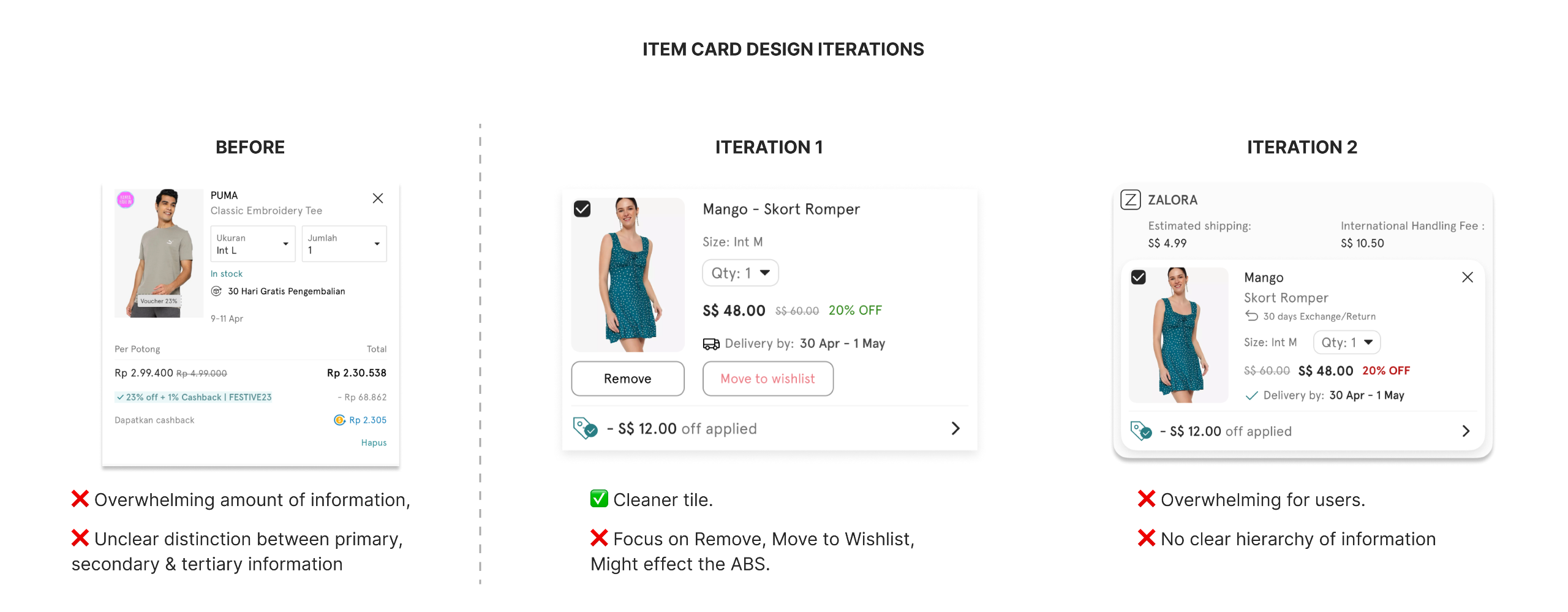
Reorganize item tiles: Present information in a clear, accessible format.
Item tile on Cart (OLD)
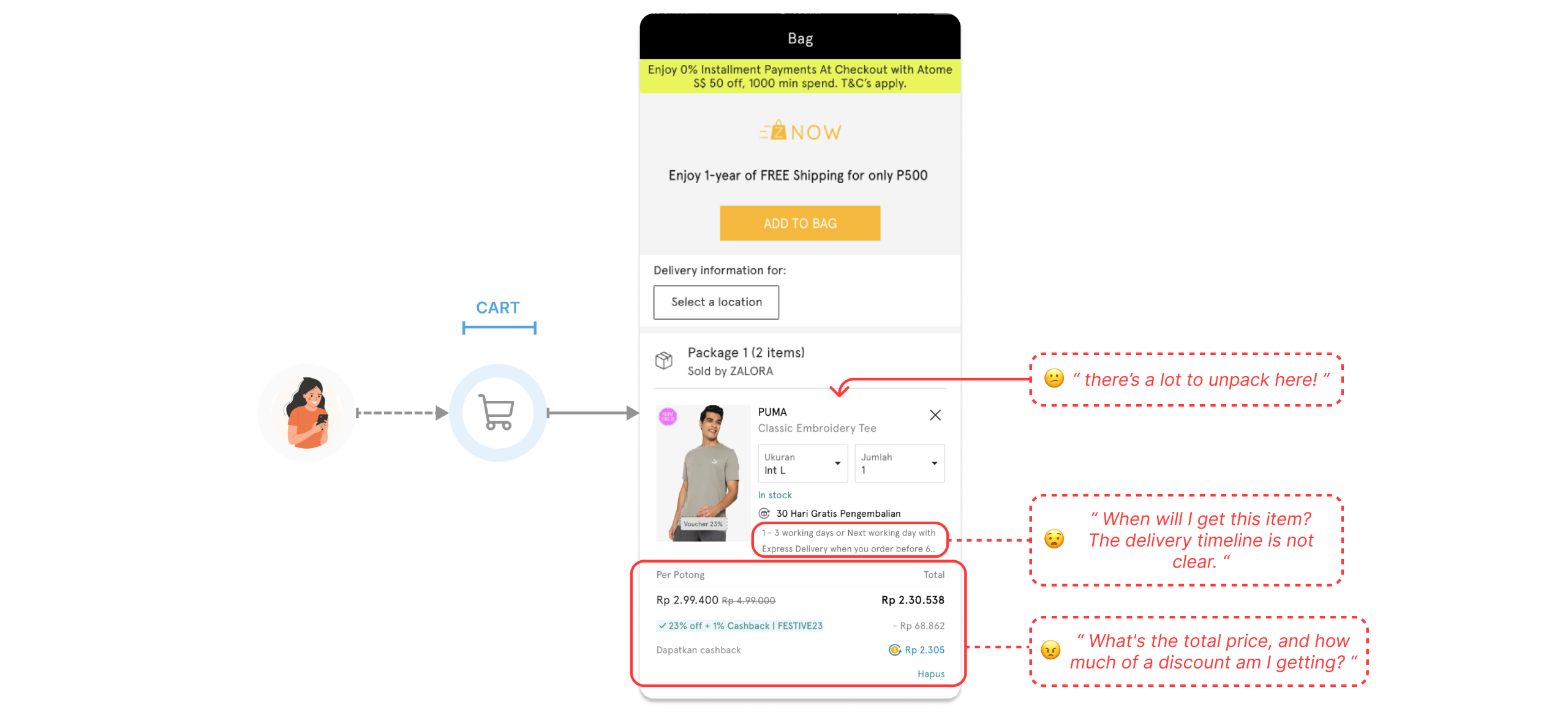
Approach
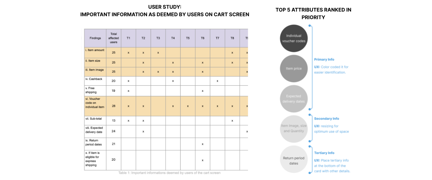
I initiated the process by conducting sketching sessions with stakeholders.
My primary objective was to create a consistent hierarchy of information on the item tile to establish a mental model.Before diving into the design phase, I focused on knowing the important information so that the customers can easily identify the products from the item tile cards
🎨 Step 3: Design Execution
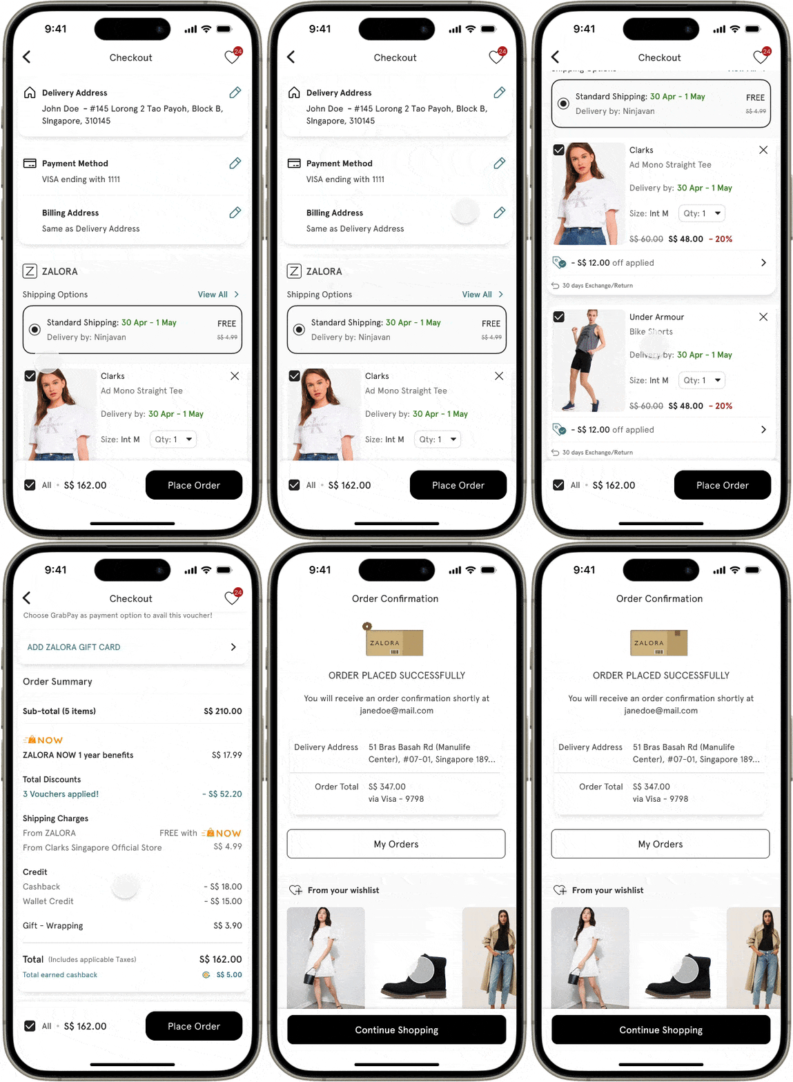
-> Radical idea (1-page checkout) - DID NOT WORK
Problems with this Idea
Information Overload - Condensing the entire checkout process into a single page overwhelmed users with too much information, making it challenging for them to focus on essential details.
Scrolling Fatigue among Indonesia participants - Users experienced scrolling fatigue, especially on smaller screens, as they navigate through a single, lengthy page. This lead to frustration and hinder the overall user experience.
Limited Contextual Guidance - Providing contextual guidance for each step became challenging on a single page, potentially leaving users without clear instructions or assistance.
Potential Higher Abandonment Rates - Users abandon the checkout process more frequently if faced with a lengthy 1-page form, especially if distractions or interruptions occur.
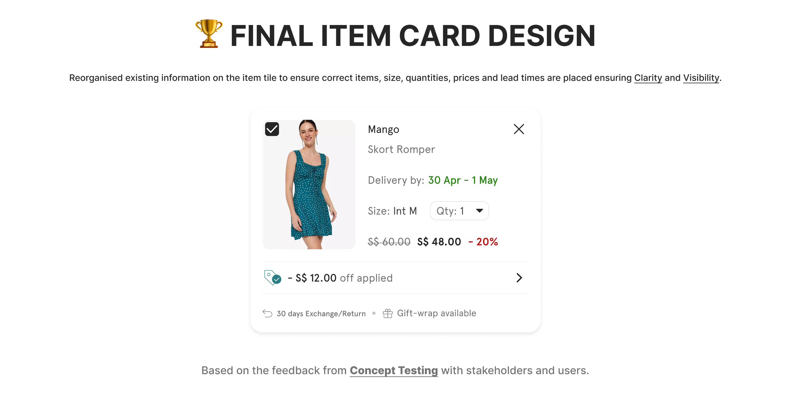
Based on the feedback from Concept Testing with stakeholders and users.
-> Checkout Steps Designs (Visuals)

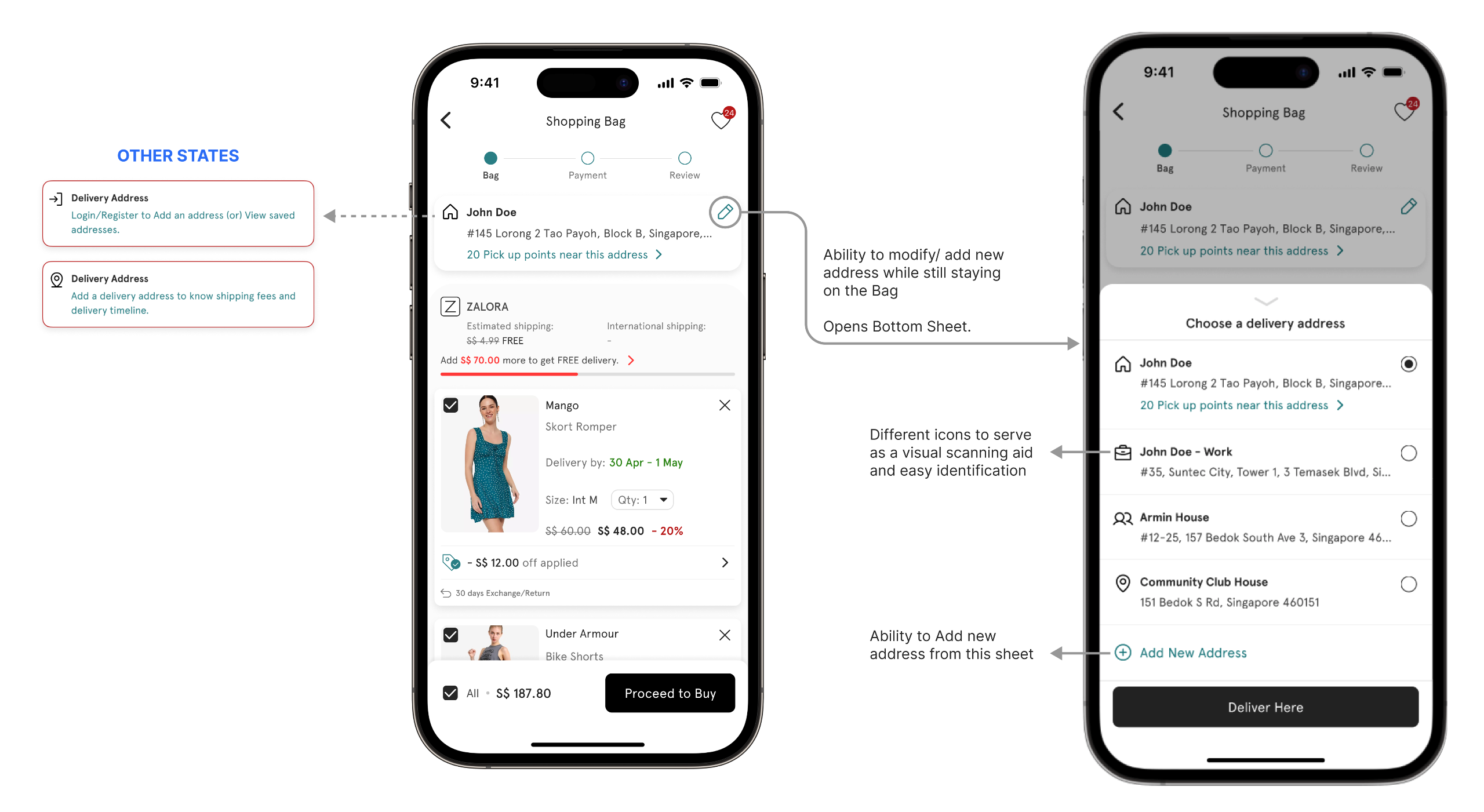
-> Address Management Designs
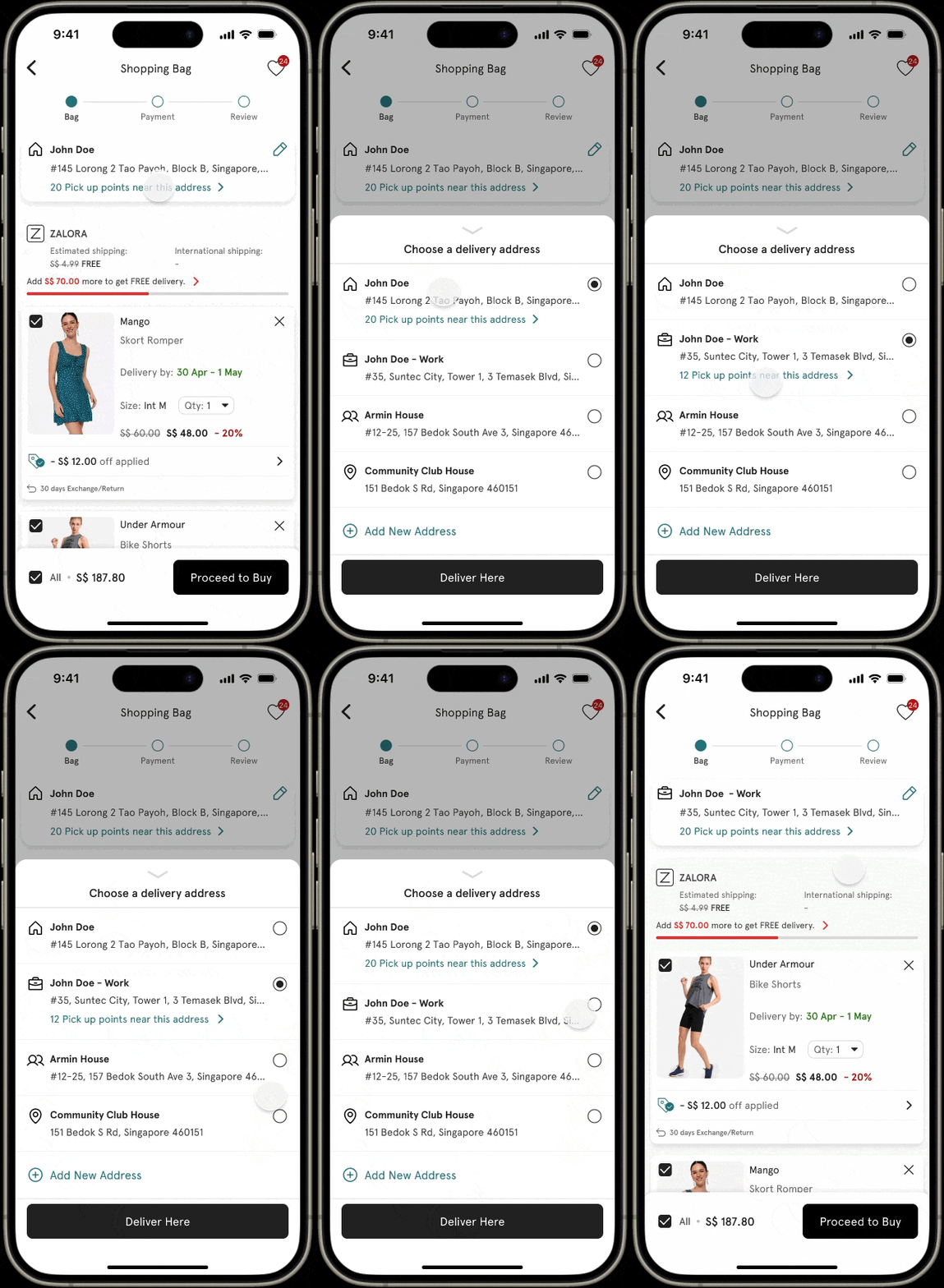
Since the Address page was removed and added to the Bag page, the address block mirrors the Information Architecture of the main card, ensuring clarity with visible details and relevant Call-to-Action buttons.
Why Address is moved to Bag page?
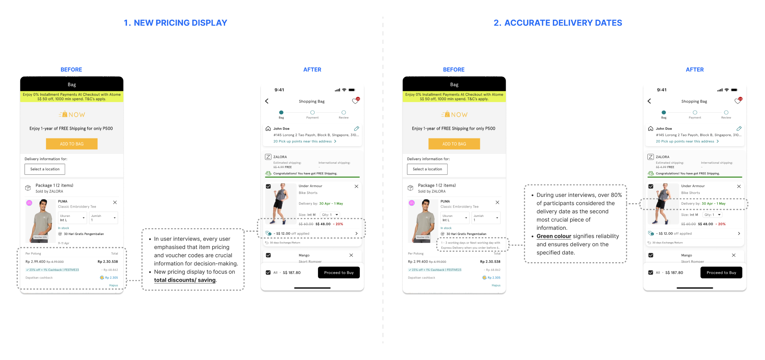
During user interviews, 80%+ participants emphasized the need for clear delivery dates on the Bag page.
To display accurate delivery dates required the user’s addresses as input.
Backend analysis revealed:
60%+ of orders are from logged-in repeat customers,
Over 70% having a default address.
Additionally, 95%+ customers had two or fewer addresses, simplifying the process further.
Flow explaining the design
Prototype
-> Item Card Designs
🤝🏻 Step 4: Stakeholder Collaboration and Design Handoff
-> My Approach to Collaboration
I actively collaborated with stakeholders throughout the redesign process, fostering alignment and ensuring their buy-in at every stage.By maintaining open communication and understanding their priorities, I was able to strategically focus on features that directly enhanced checkout completion rates and minimized cart abandonment.My approach involved balancing business goals with user needs, leveraging data insights and stakeholder feedback to prioritize impactful design decisions.This collaborative effort not only ensured the success of the project but also demonstrated my ability to align cross-functional teams around a shared vision, a critical skill for driving user-centered innovation.
Regular Workshops: Conducted brainstorming and feedback sessions to align on goals and user pain points.
Design Reviews: Presented iterative updates, incorporating insights from cross-functional teams (product, engineering, and marketing).
-> Deliverables
Interactive Prototypes: Created Figma prototypes to visualize flows and interactions.
Design Specs: Provided detailed guidelines to ensure consistent implementation across platforms.
-> Figma Snippets
Here’s an exclusive look into my Figma file, where strategy meets creativity.
These snippets showcase the design flows and detailed item tile anatomy, reflecting my meticulous approach to design.
My process involves crafting seamless user experiences through structured workflows, precise visual hierarchies, and attention to detail.
This glimpse highlights my ability to translate complex requirements into intuitive designs, ensuring clarity and usability at every step.
As a designer, I take pride in maintaining an organized and collaborative workspace, enabling teams to align easily and iterate efficiently.
This is just a small window into how I bring ideas to life, a skillset that I believe aligns perfectly with the leadership and vision your team seeks.
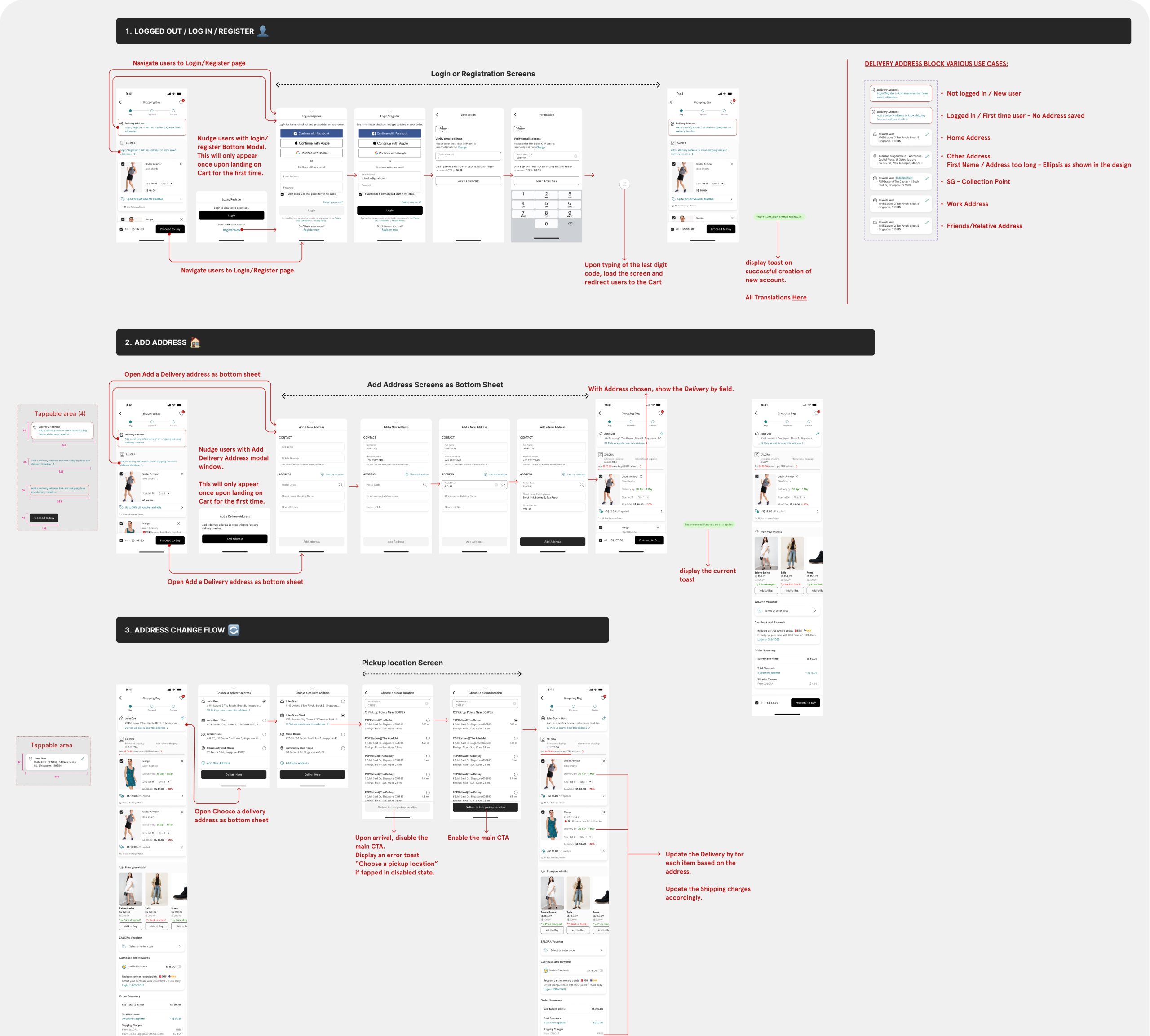
Comprehensive design flows documented for seamless collaboration with PMs and developers.
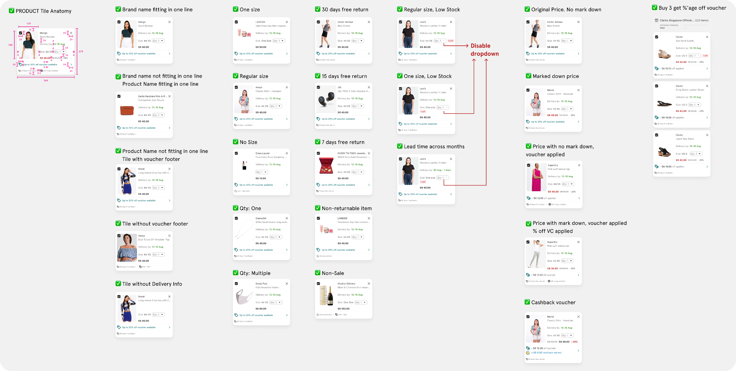
Detailed item tile anatomy covering all use cases for clarity and implementation.
🚀 Release & Impact
As with any major release in a large e-commerce platform, this project relied heavily on partial releases and A/B testing.The successful outcomes of the partial releases and A/B testing demonstrated the positive effects of the new checkout design on the platform's performance.
| +6.45% | Checkout completion rate |
| -15% | Cart Abandonment |
| +24% | Average Order Value |
| +$40K | Monthly Revenue |
📉 Improvements Post Launch
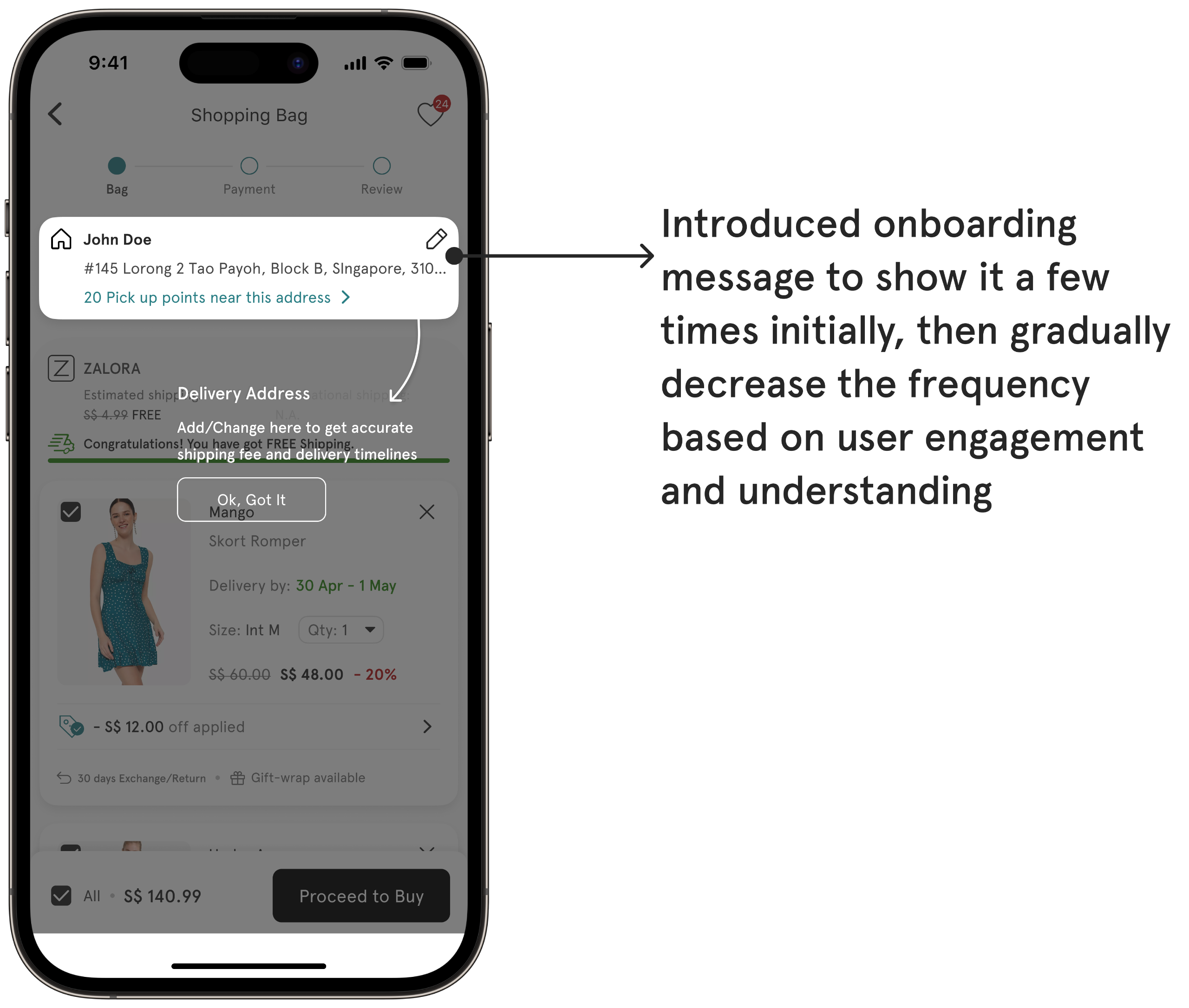
1️⃣ Shifting the Address process to the Bag page unintentionally caused a 25% increase in customer support tickets related to post-purchase address changes.
This indicated that users were either overlooking the address selection step or finding it unclear in the new flow.
To address this, I conducted a competitive analysis to study how other e-commerce platforms handle similar address confirmation steps.
This analysis revealed that providing a brief, contextually-timed onboarding message during the initial user interactions significantly improved user clarity and reduced errors.
Drawing inspiration from these insights, we introduced a targeted onboarding message that appeared a limited number of times, guiding users to confirm or modify their address during checkout.
This approach not only improved user understanding of the process but also minimized post-purchase errors, leading to a noticeable reduction in customer support tickets.
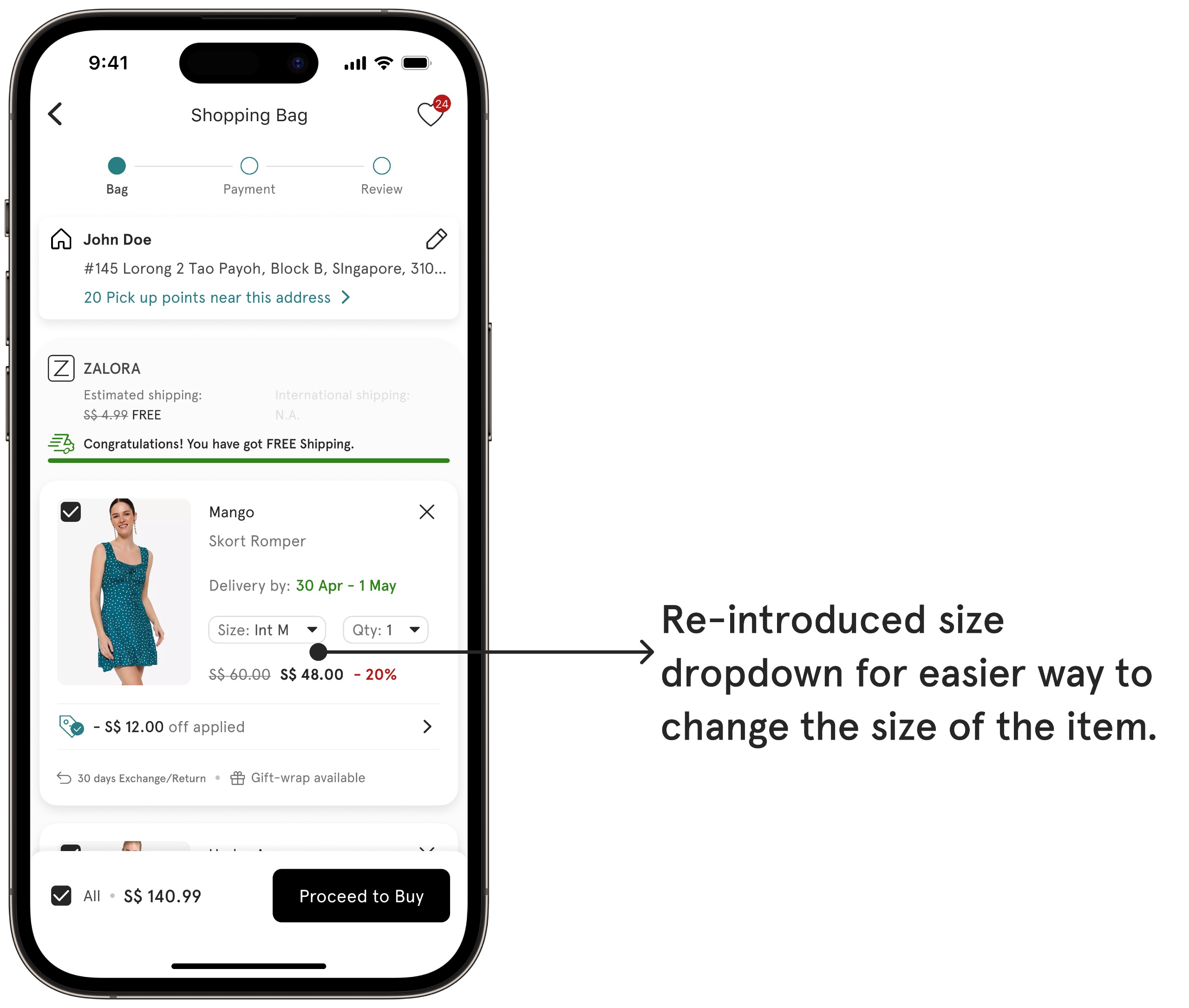
2️⃣ The 'Edit Size' option was removed from the cart page. However, after the release, we observed a 15% increase in exchange requests.
Background:
Through research, we identified that customers generally confirm their size during the product discovery phase, and the 'Edit Size' option in the cart was rarely utilized.
Based on this insight, the decision was made to remove the 'Edit Size' option from the cart page to streamline the shopping experience and reduce potential distractions.
However, after implementing this change, we noticed an unexpected 15% increase in exchange requests, revealing that customers still required flexibility to adjust sizes later in the purchasing journey, particularly when reviewing their order in the cart.
Solution (A/B Test):
To address this issue, we conducted an A/B test on the new cart design: one version without the size dropdown and another with it included.
The version with the size dropdown resulted in a 12% reduction in exchange requests, validating that reintroducing the feature would better cater to customer needs without compromising the overall shopping experience.
💡 My Learnings
Simplicity Matters: A streamlined checkout reduces friction and drives conversions.
Consistency is Key: Cross-platform trust builds loyalty and repeat purchases.
Data Drives Design: Insights from users ensure impactful, user-focused improvements.
This redesign not only elevated ZALORA’s cart experience but also showcased how thoughtful design can directly impact business outcomes.
Redesigning ZALORA’s Post Purchase: Delivering Key Information Effortlessly by Achieving a 6% Reduction in Customer Support Contacts Across Six Ventures in H2’22, While Saving ~€50K Annually in Support Costs
Problem Statement
How we enhanced the ZALORA My Orders page to provide users with efficient access to necessary information, reducing the need for customer support assistance
My Role
Design Leadership: Spearheaded the project from ideation to execution.
User-Centered Approach: Advocated for user needs at every step.
Responsive and Consistent Design: Ensured uniformity across devices.
Collaboration: Worked closely with cross-functional teams.
Impact
6% reduction in CS contact rates across 6 ventures in H2’22
Estimated ~50k EUR in cost reduction related to CS
Significant boost in customer satisfaction and engagement
Zalora's My Orders before the redesign
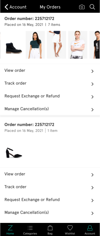
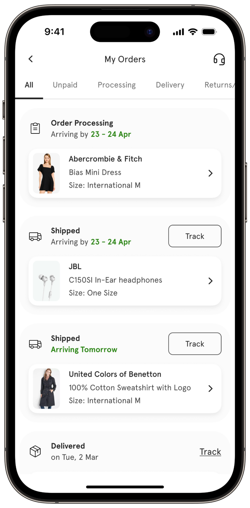
My Orders after the rebuild
-> Step 1
Understanding the problem
Primary Research
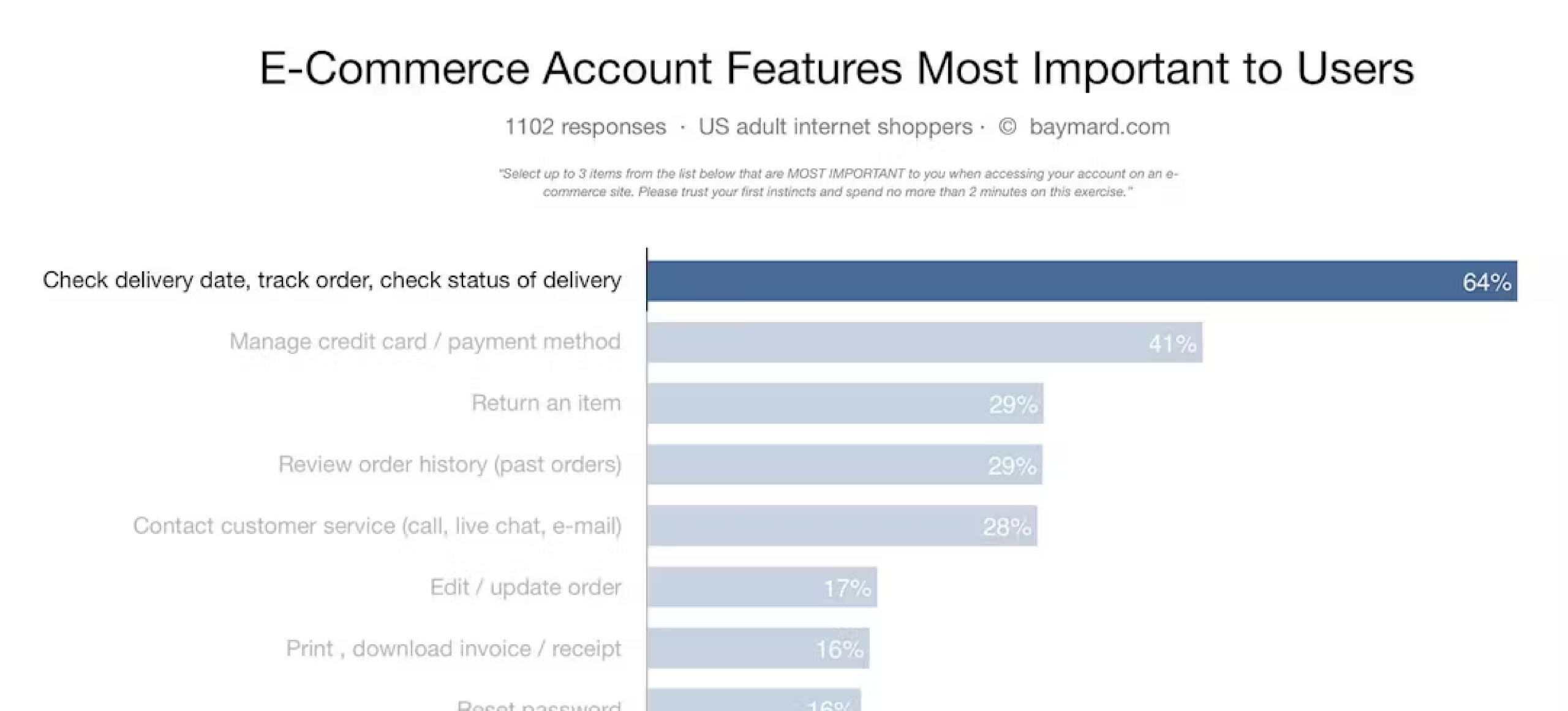
Through our primary research we found Tracking orders was by far the most sought-after feature.
In the entire experience that the single most important self-service feature for users is tracking of open orders, primarily order status and arrival date.
Backend Analysis
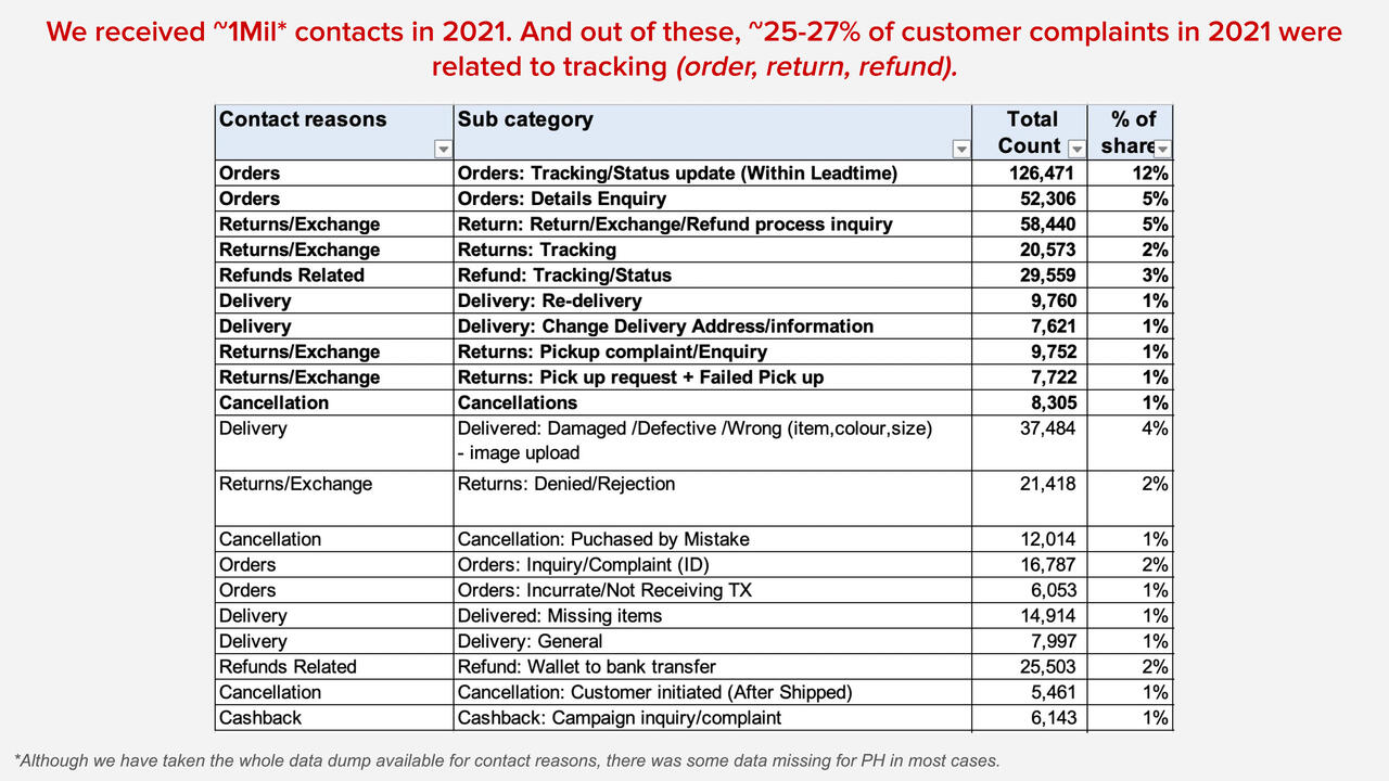
~27% of Customer complaints related to tracking.
Customers inquiry about the date of delivery for the order they have placed.
Customer enquiry on missing details such as discount, cashback etc.
-> Problem #1 - Nested and Missing Information
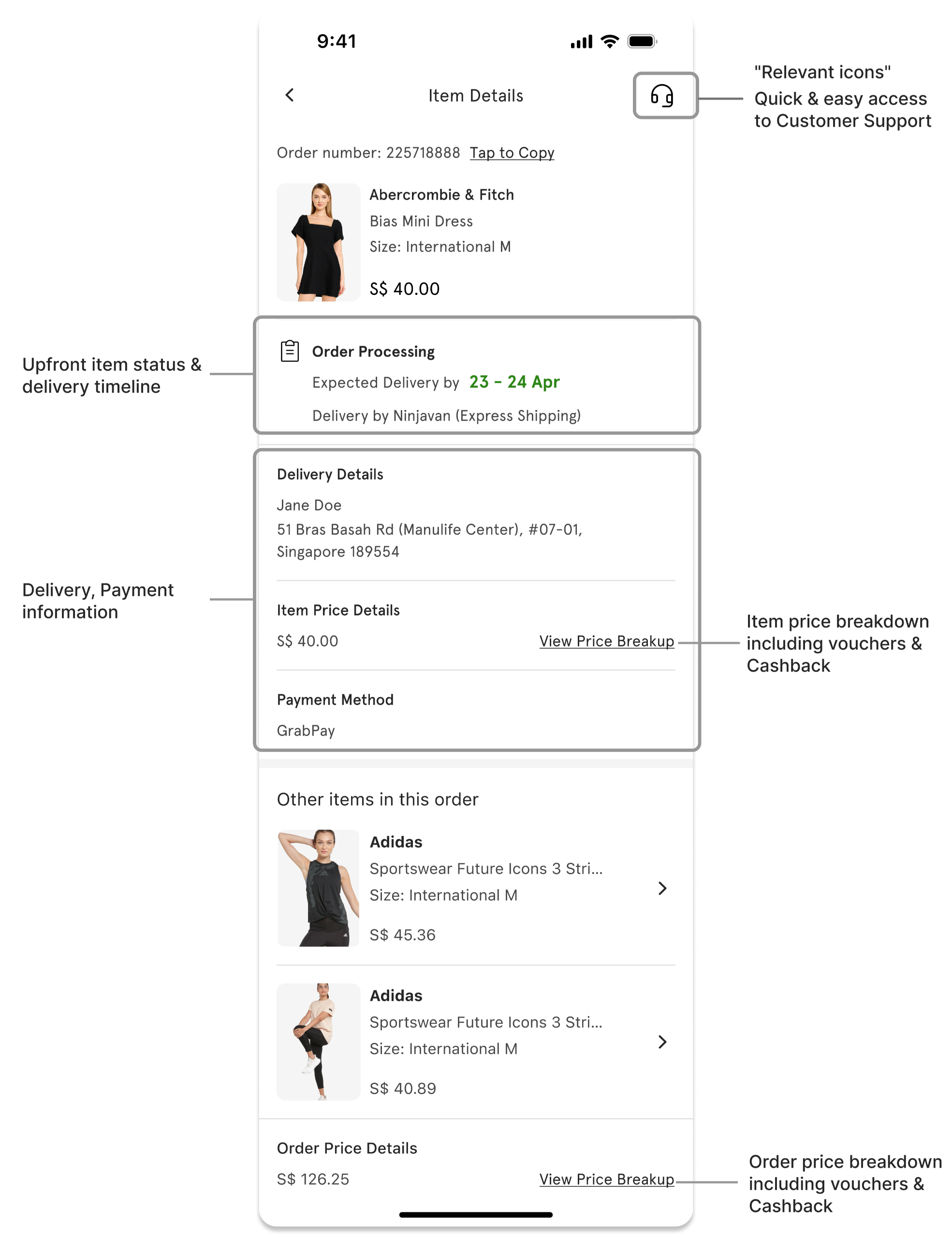
Customers encounter difficulties in locating important delivery information and tracking details for their orders.
The absence of relevant details per item, such as brand name, size, and price, is causing confusion and inconvenience for customers who need to track, review, or manage individual items within their orders
Solution Approach
My primary objective was to establish a seamless display of items.
Before designing a solution to enable easy access to delivery tracking, I focused on fixing the display of items on My Orders.
New Look
My Orders Design
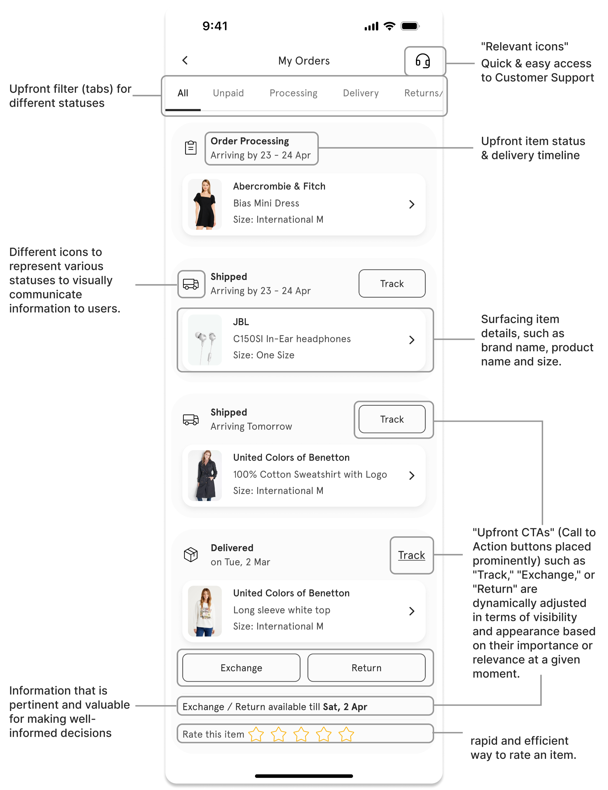
Item Details Page Design
Detailed Designs
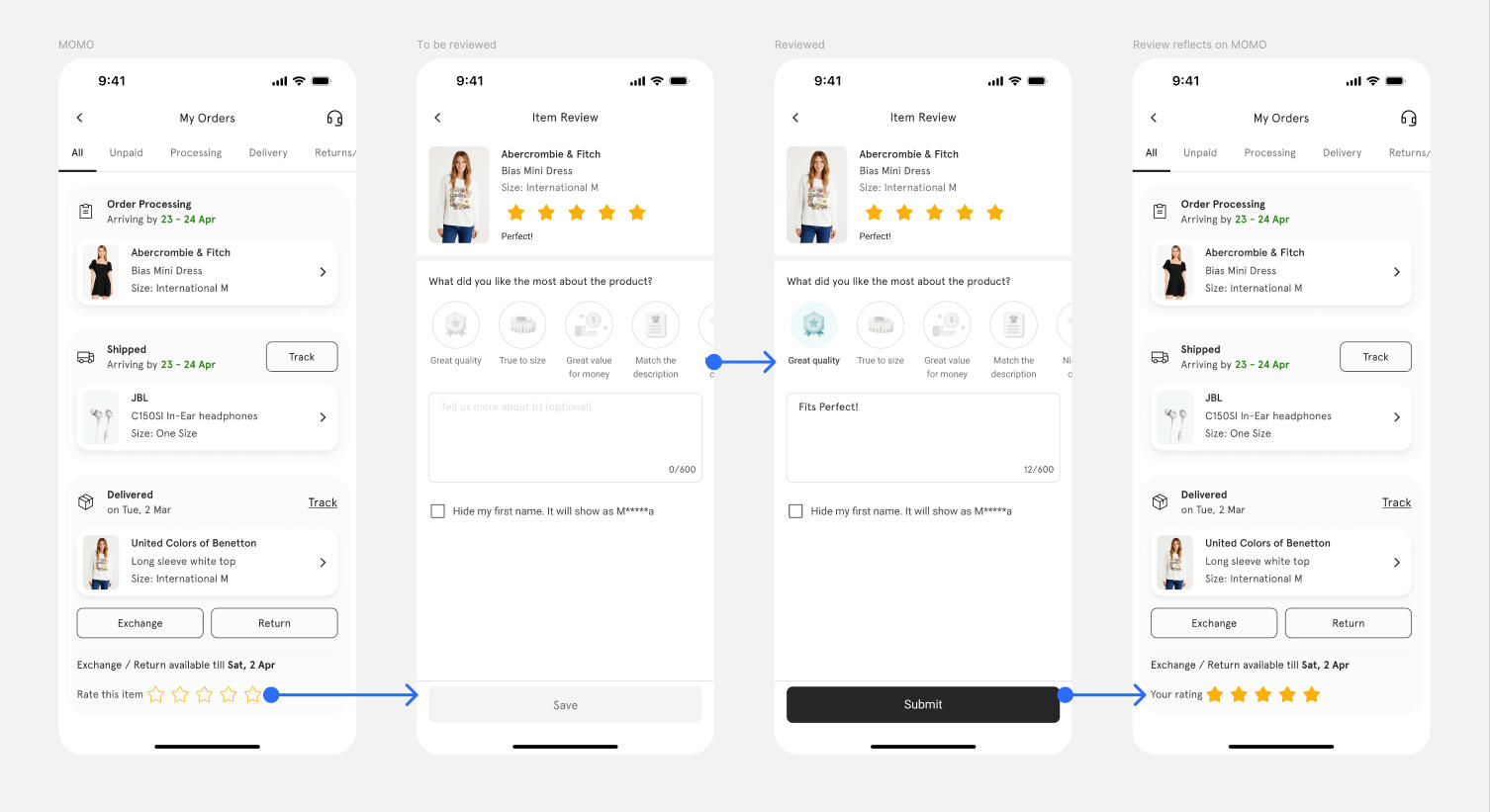
New Post Purchase experience
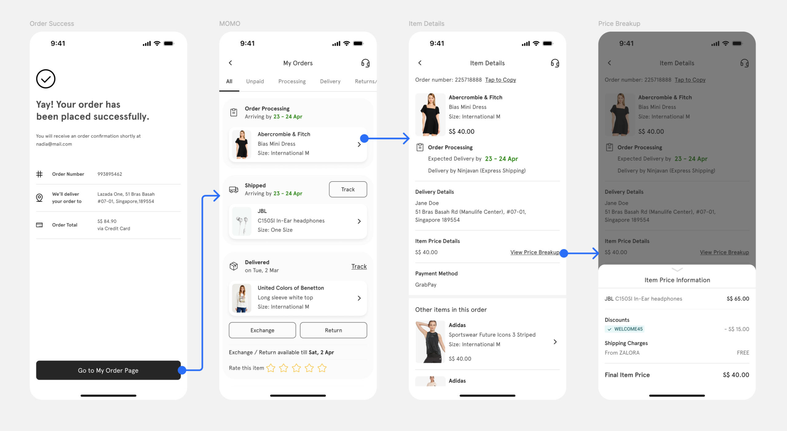
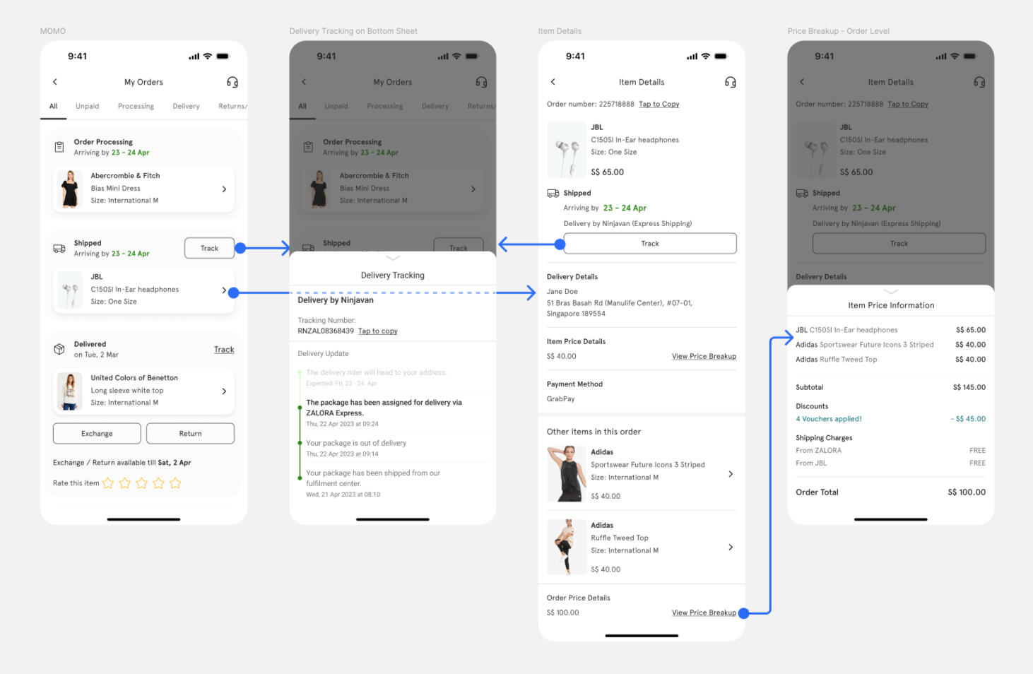
Item Tracking flow
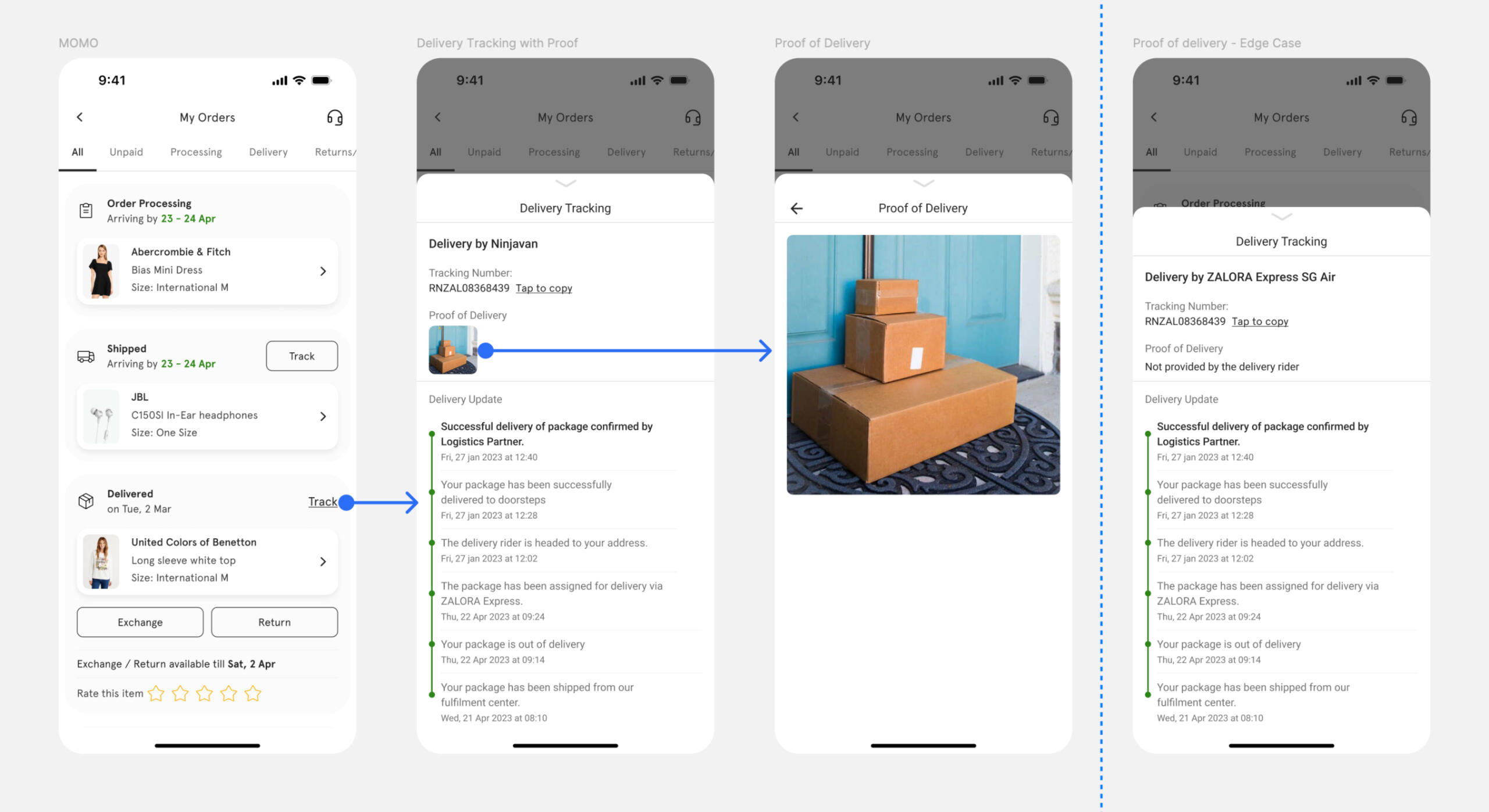
Proof of Delivery flow
Item review flow
Problem #2 - Parity with our Apps
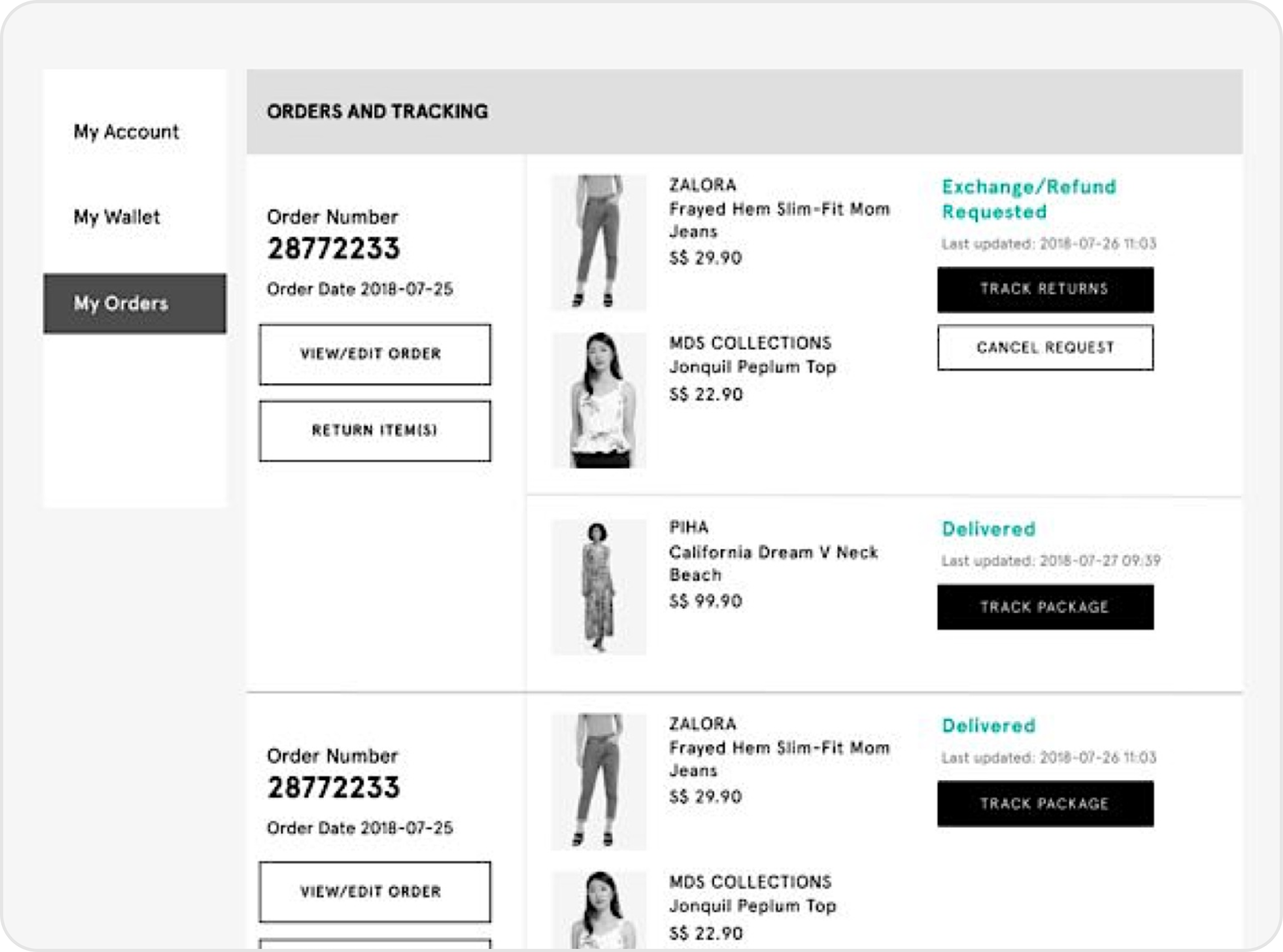
Zalora has been a mobile-first product company for many years now; due to this our website experience constantly lags on features with our apps.
Our website needed a separate design effort each time we built new features. Hence we had to spend a huge amount of bandwidth to simply adapt our experiences for the web.
Our apps had moved to a refreshed design language — We needed to scale that language to our website to be consistent for our users.
Zalora's My Orders before the redesign
My Orders after the rebuild
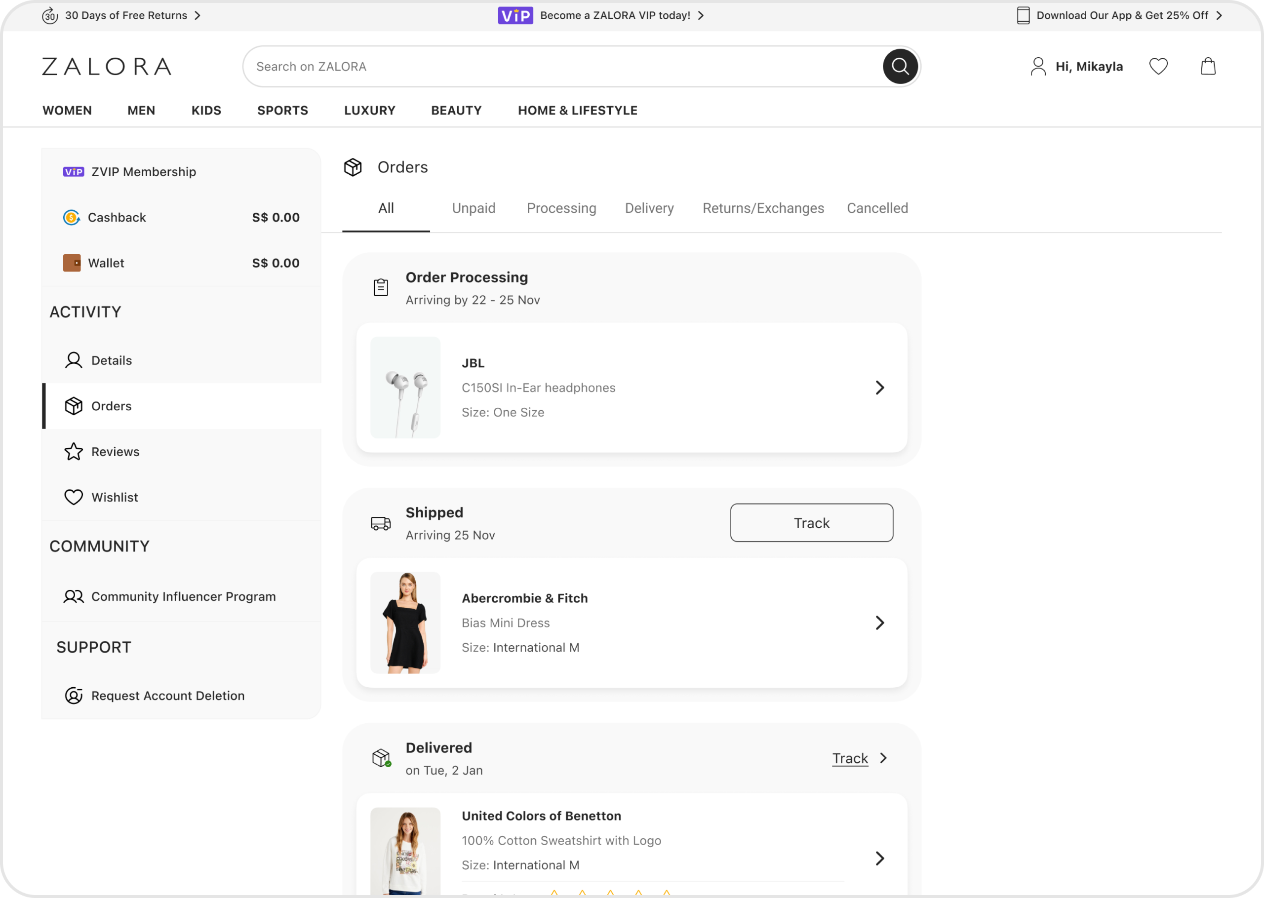
Solution Approach - New Web Design
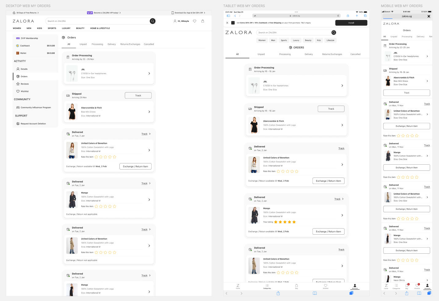
Responsive Design — We ensure the layout is responsive and optimised for various screen sizes, including tablet devices for which the design never existed.Our website needed a separate design effort each time we built new features. Hence we had to spend a huge amount of bandwidth to simply adapt our experiences for the web.
Layout & Structure — Maintained a similar layout and structure for the cart page on both web and app platforms. Kept important elements such as the item list, checkout summary, and navigation options in consistent locations.
Color Scheme and Branding — Used the same colour palette (Noir 2.0) and branding elements across both platforms to ensure a cohesive look and feel.
Empty Cart State — When the cart is empty, designed a visually appealing message or image encouraging users to continue shopping.
Designs
Visualisation of the responsive design breakpoints of the new My orders.
Release & Impact
Release
As with any major release in a large e-commerce platform, this project relied heavily on partial releases and A/B testing.The successful outcomes of the partial releases and A/B testing demonstrated the positive effects of the new checkout design on the platform's performance.
Impact
| -6% | Decrease in delivery-related customer inquiries across H2'22 |
| ~126,471 | Fewer Customer calls |
| €50K | Estimated cost reduction in Euros related to CS |
ADP Master Tax - Revamp
Problem Statement
Simplify the complex process of Quarter End Workflow and increase the overall customer engagement.
My Role
Led project from inception to execution
Creating experience map & user scenarios
Validating user insights with stakeholders
High fidelity designs
User feedback on the design (Partially involved)
Impact
Improved overall accessibility and usability
Reduced Report generation by effective data display
Reduced Reconciliation burden by including error reports
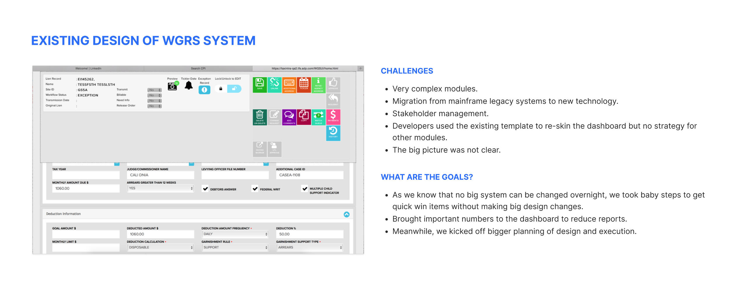
Current design and Challenges
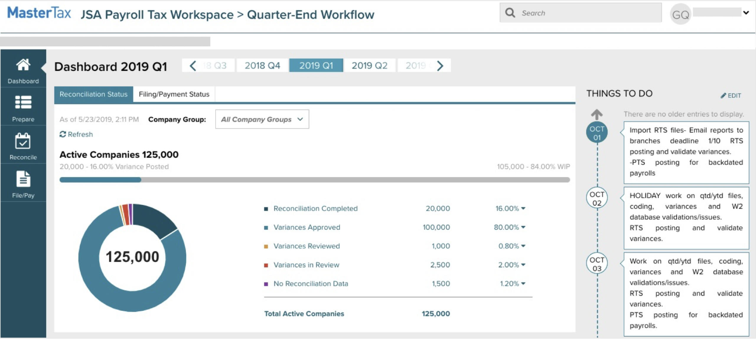
Challenges
Very complex modules.
Migration from mainframe legacy systems to new technology.
Stakeholder management.
Developers used the existing template to re-skin the dashboard but no strategy for other modules.
The big picture was not clear.
Solution Approach
To get the best insights, picked 3 distinct user groups for our user interviews:
USER GROUP 01 - Large service providers
USER GROUP 02 - Small service providers
USER GROUP 03 - Enterprise (Individual)
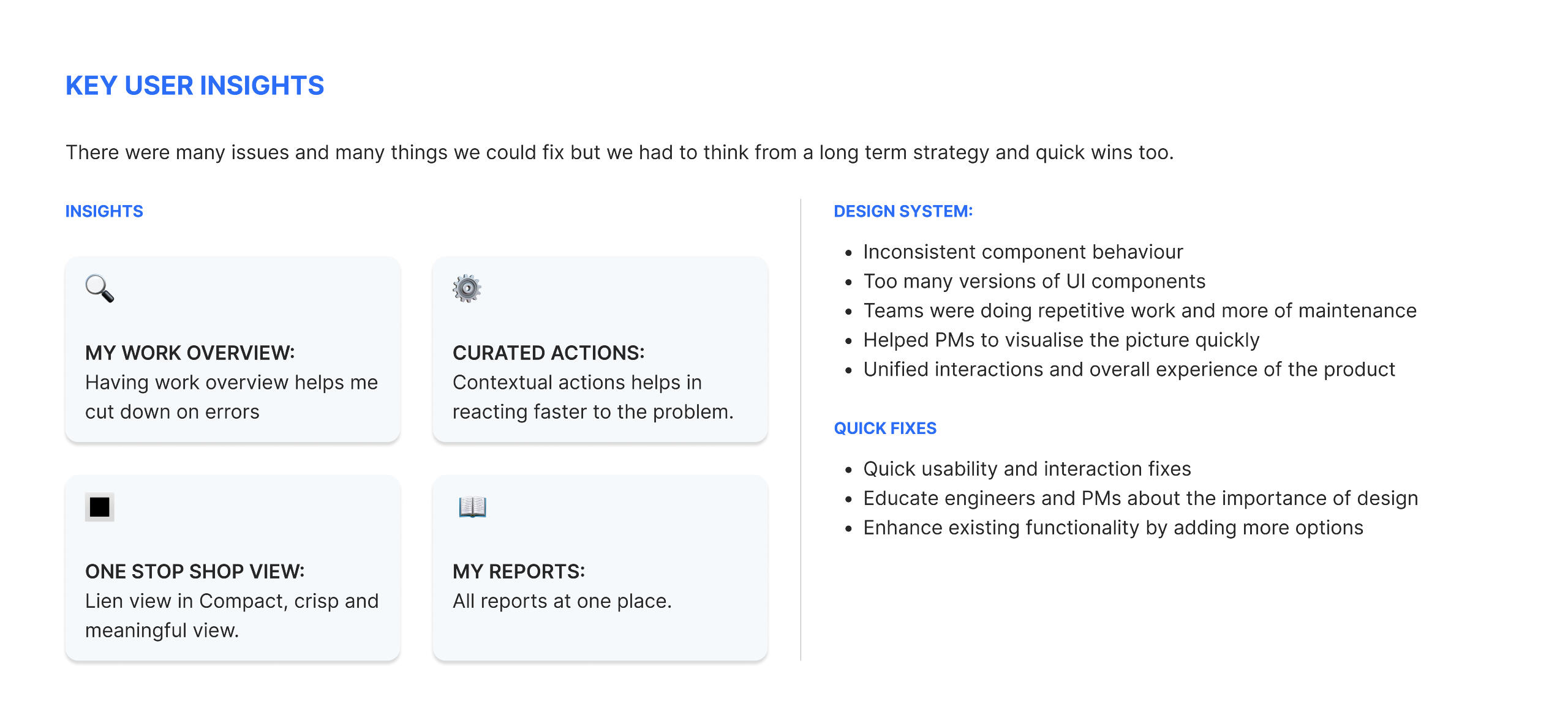
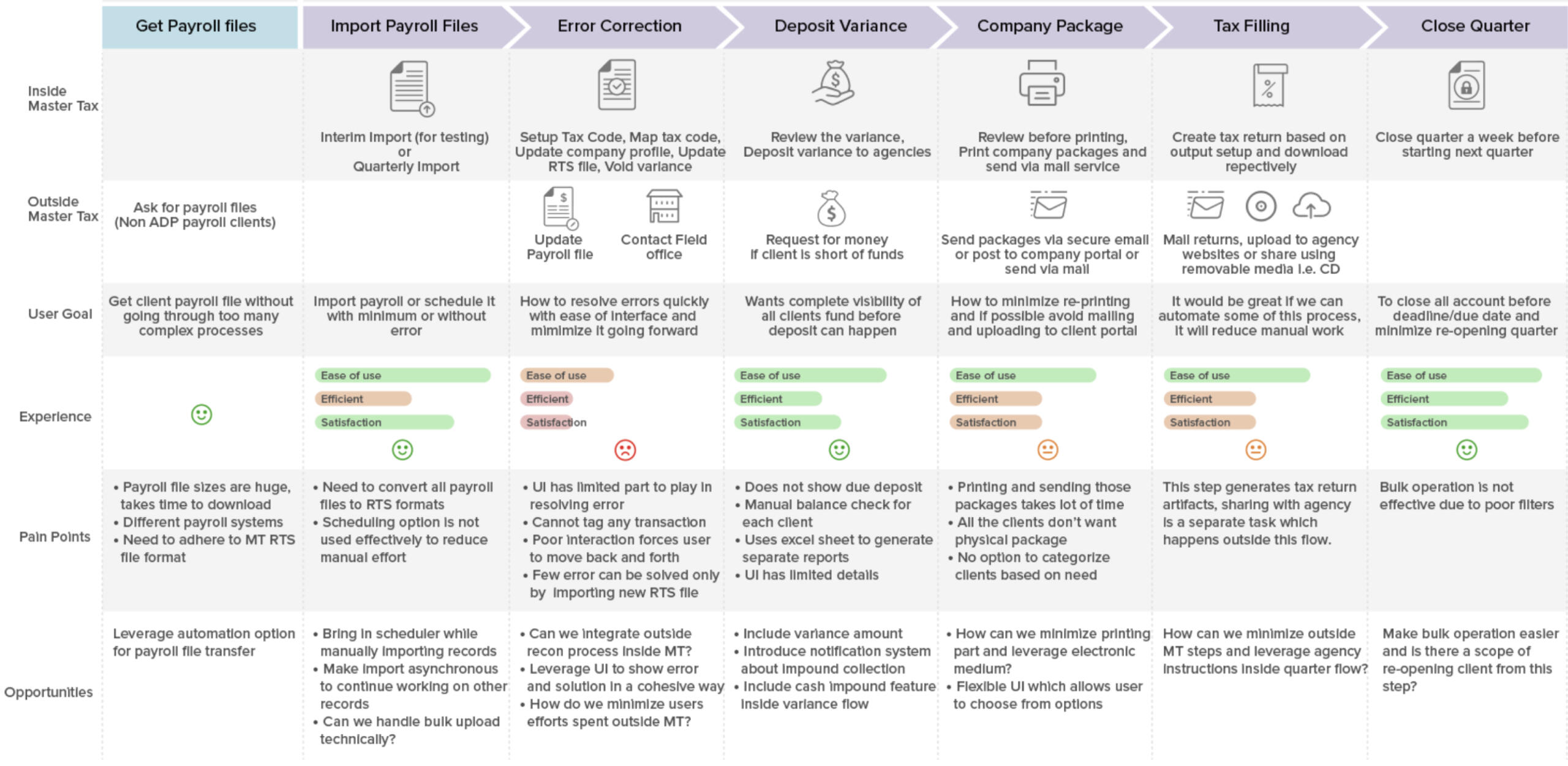
Following are the key user insights:

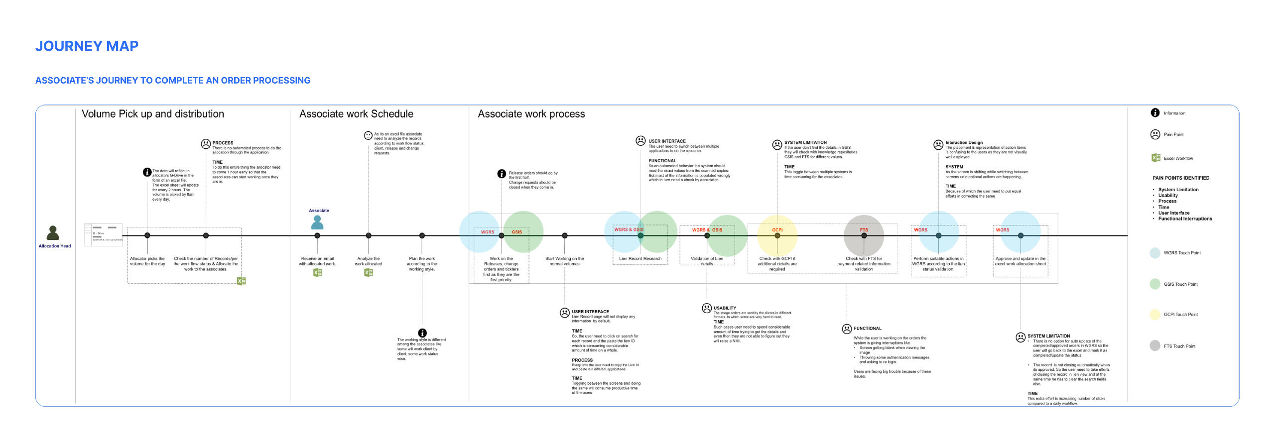
Experience Map:
Designs
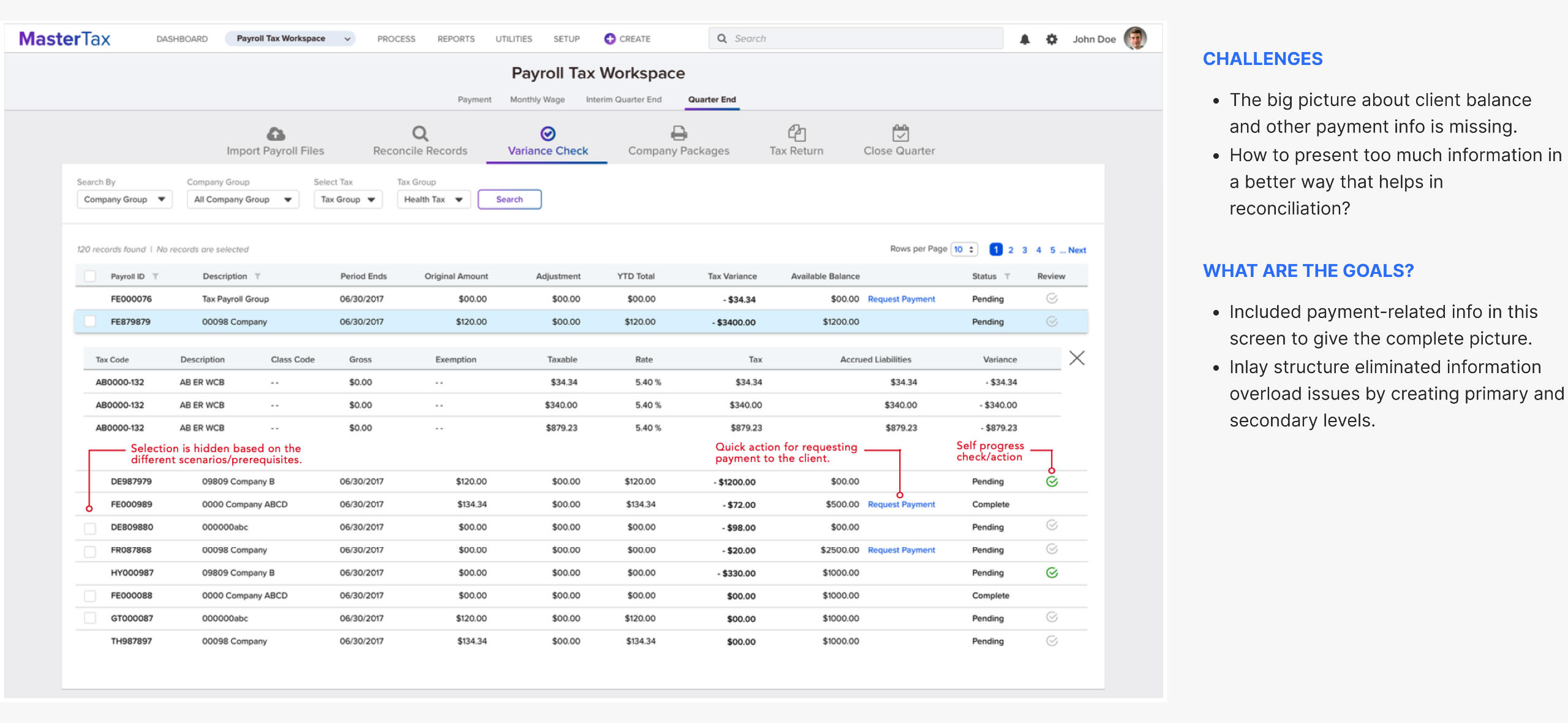
Reconciliation process
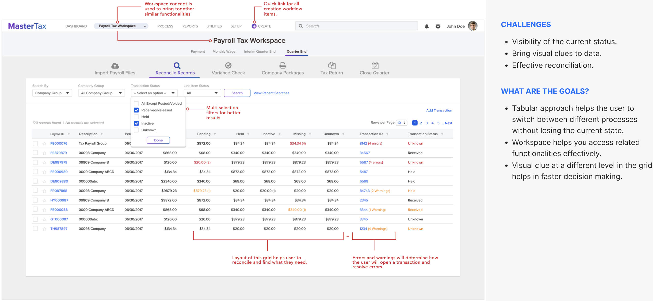
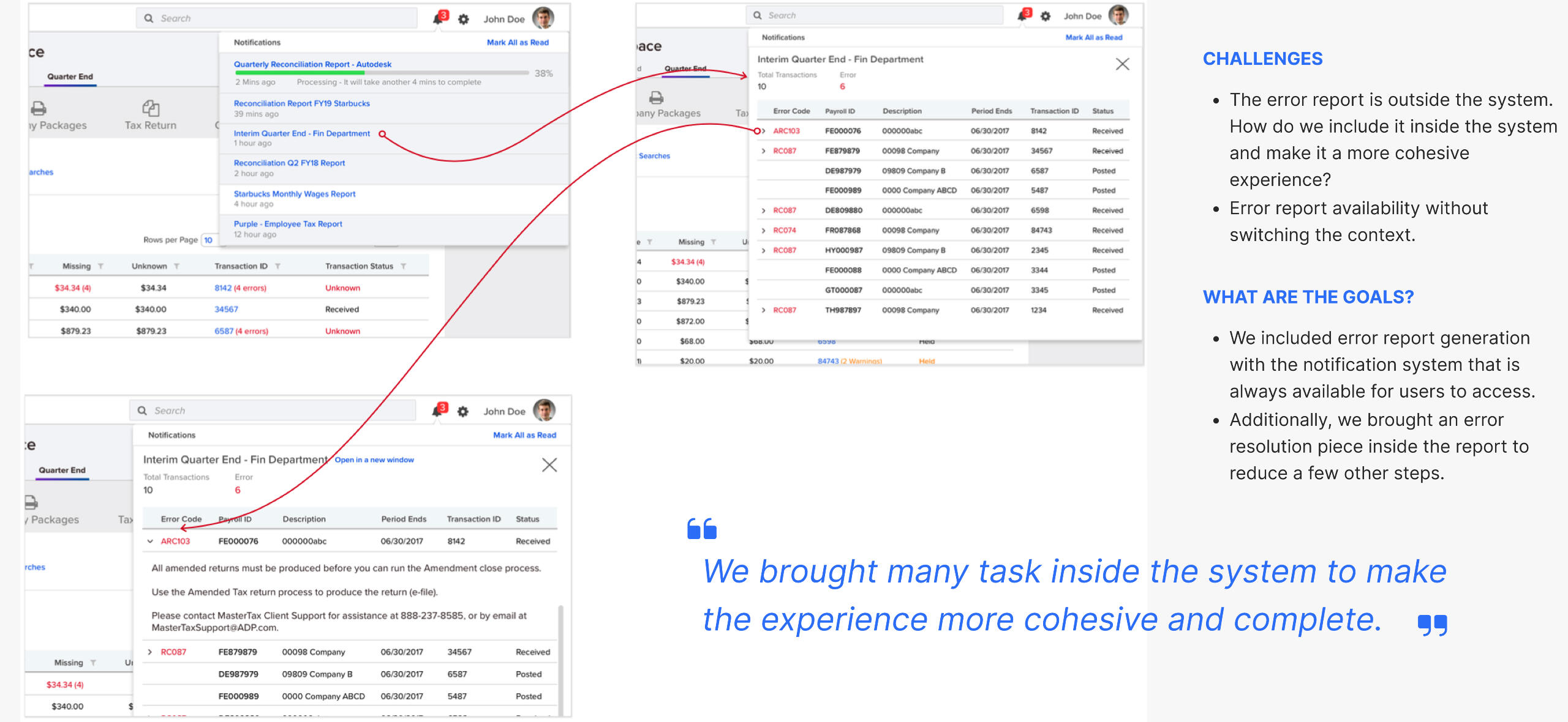
Error handling
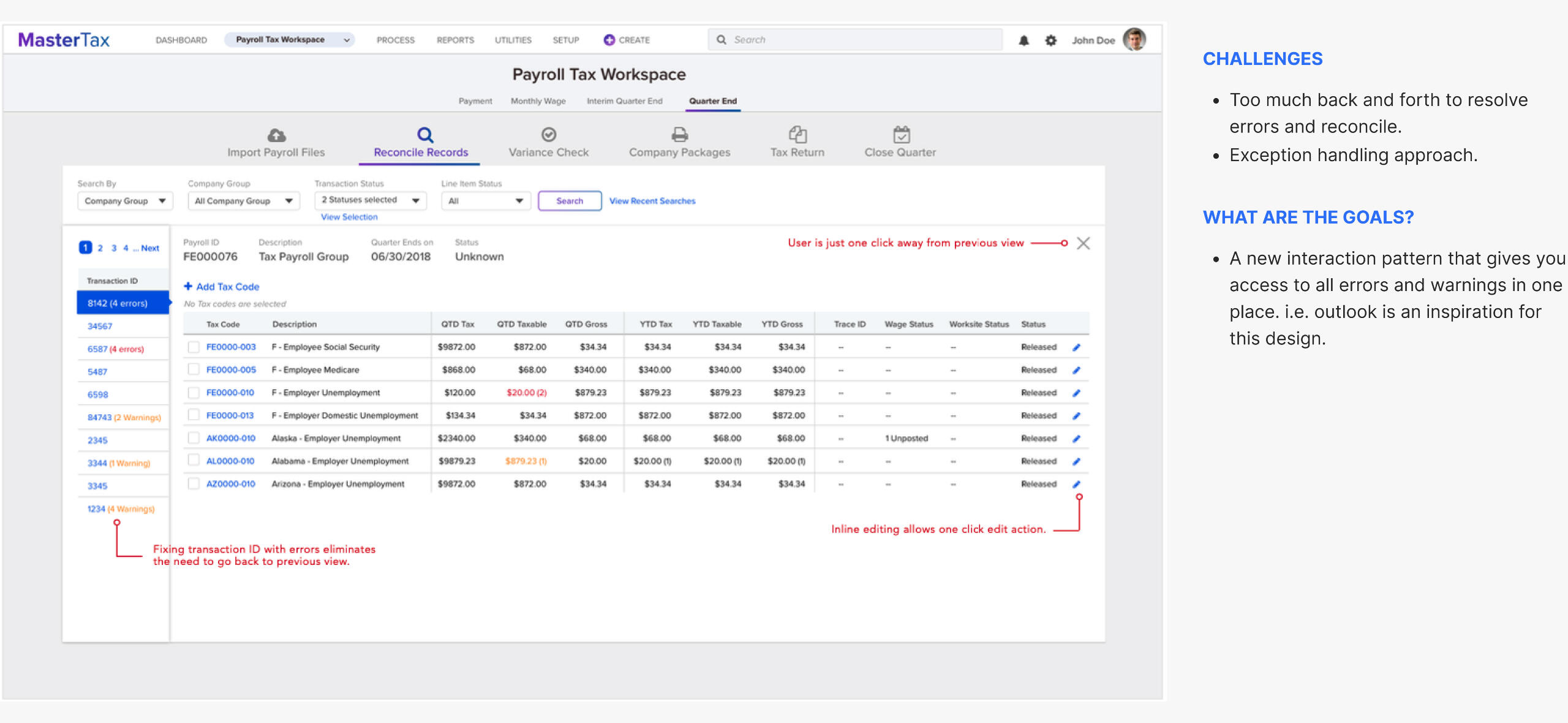
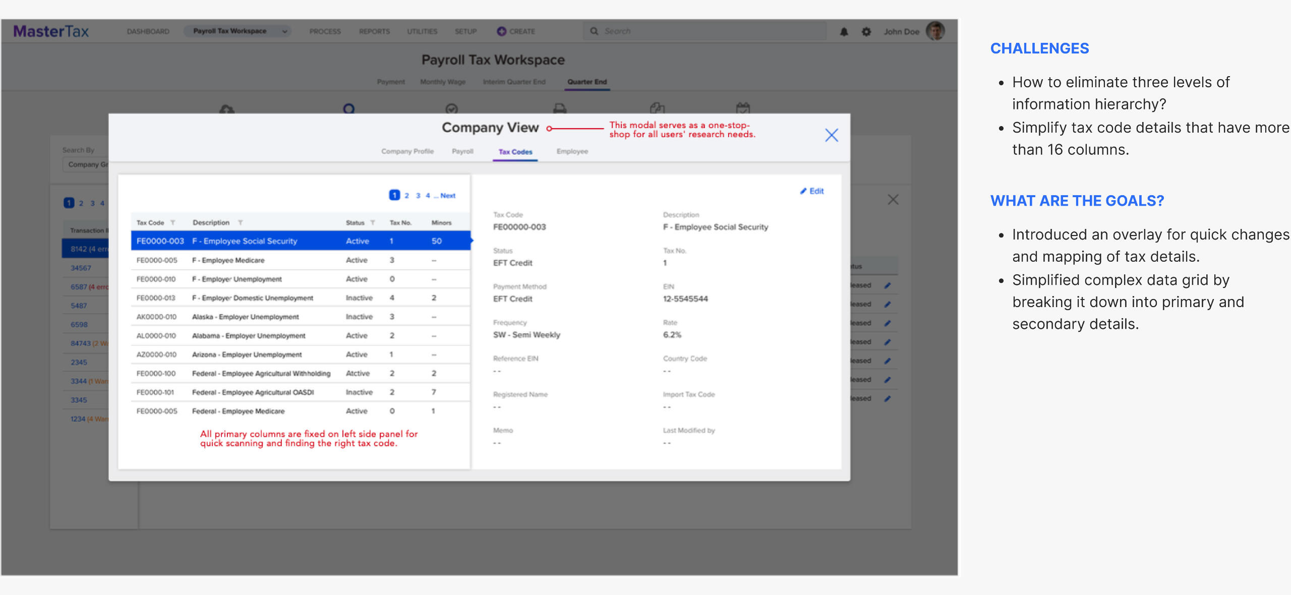
One-stop shop for all info
Error reports & notifications
Tax variance check
Release & Impact
| Improved | Overall accessibility and usability |
| Reduced | Report generation by effective data display |
| Reduced | Reconciliation burden by including error reports |
| Introduced | A big picture of overall tax filling status |
| Acceptance | By the major client base |
